Learn Data Visualization with Power BI in 2 Hours

Ever looked at a spreadsheet filled with thousands of numbers and thought, “There’s gotta be a better way to see this?” That’s exactly where data visualization comes in. It’s like turning raw, boring data into stunning visuals that actually make sense at a glance. And guess what? You don’t need weeks or months to learn it. In just two hours, you can get up to speed with Power BI data visualization and start making sense of numbers like a pro.

By the way, if you’re serious about learning tech skills, check out the Cybersecurity Course by Imarticus Learning. Cyber threats are growing, and knowing how to protect data is just as important as analysing it.

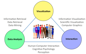
But First…What is Data Visualization?

Before we dive into the nitty-gritty of Power BI, let’s answer a simple yet crucial question: What is data visualization?

In simple terms, data visualization is the art of transforming raw numbers into visual formats like graphs, charts, and maps. Instead of going through endless rows of data, you get a quick, clear, and interactive representation of trends and insights. It’s used in everything from business intelligence to scientific research.

Why Data Visualization Matters

Imagine trying to explain the rise of e-commerce sales over the last 10 years with just a table full of numbers. Painful, right? But turn that into a simple line chart and boom! The trend becomes crystal clear.

Key Benefits:

  • Quick Insights: Visuals help spot patterns and trends faster.
  • Better Decision-Making: Stakeholders can make informed choices.
  • Engagement Boost: People understand and remember visual data better.
  • Error Detection: Spot anomalies that might be missed in raw data.

Types of Data Visualization

Not all visualizations are the same. Some work best for trends, others for comparisons. Here’s a quick breakdown of the types of data visualization you should know:

Type Best For Example
Bar Chart Comparing categories Sales per region
Line Chart Showing trends over time Stock price movement
Pie Chart Displaying proportions Market share of brands
Heatmap Identifying patterns Website click rates
Scatter Plot Showing relationships Height vs. weight correlation

Choosing the right visualization depends on what kind of story you’re trying to tell with your data.

Getting Started with Power BI Data Visualization

Now that you understand the basics, let’s get to the exciting part: Power BI. If you haven’t heard of it, Power BI is Microsoft’s powerful tool for creating interactive dashboards and reports. It’s one of the top tools for data visualization and is widely used in business intelligence.

Setting Up Power BI (Takes Less Than 10 Minutes!)

  1. Download & Install: Get Power BI Desktop from Microsoft’s official website.
  2. Load Data: Import an Excel file, SQL database, or even online data.
  3. Choose Visualization Type: Pick from bar charts, line graphs, maps, and more.
  4. Customise & Format: Adjust colours, labels, and filters to make it visually appealing.
  5. Publish & Share: Upload to Power BI Cloud for easy access.

That’s it! You’re now ready to create stunning Power BI Data Visualization projects.

Hands-On: Creating Your First Power BI Dashboard in 30 Minutes

To truly grasp Power BI data visualization, let’s build a simple sales report. Follow these steps:

  1. Import Sample Data: Use Power BI’s built-in sample datasets.
  2. Drag and Drop Visuals: Add a bar chart for sales by region.
  3. Filter the Data: Use slicers to let users interact with data.
  4. Customize Design: Change colors, fonts, and labels for clarity.
  5. Save & Share: Export the dashboard for presentation or team collaboration.

By the time you finish this, you’ll have a fully functional Power BI data visualization dashboard.

Advanced Tips to Take It to the Next Level

Once you’ve got the basics down, here are a few pro tips:

  • Use DAX Formulas: These help in creating advanced calculations within Power BI.
  • Integrate with Excel: Power BI works seamlessly with Excel for dynamic reporting.
  • Automate Updates: Set up scheduled data refresh to always have the latest insights.
  • Use AI Insights: Power BI has built-in AI-driven analytics for deeper data understanding.

Conclusion

Data is everywhere, and making sense of it is a game-changer. Whether you’re a student, analyst, or business owner, mastering Power BI data visualization will help you make smarter decisions, faster. Plus, with just two hours of focused learning, you can create stunning, interactive reports that stand out.

And hey, since you’re diving into tech skills, don’t forget to check out the Cybersecurity Course by Imarticus Learning. In today’s digital age, protecting data is just as critical as analysing it.

Frequently Asked Questions

What is data visualization, and why is it important?

Data visualization is the process of converting raw data into graphical formats like charts and graphs. It helps in better decision-making and trend analysis.

What are the main types of data visualization?

Some of the most common types of data visualization include bar charts, line charts, pie charts, heatmaps, and scatter plots.

Is Power BI good for data visualization?

Yes! Power BI data disualization is one of the best tools for creating interactive reports, dashboards, and analytics in a user-friendly way.

Can I learn Power BI in two hours?

Absolutely! While mastering all aspects takes time, you can learn the basics of Power BI Data Visualization and create simple dashboards within just two hours.

Why Data Visualization is Essential for Analysts

Data is everywhere. Businesses, governments, and analysts rely on it. But raw numbers mean little. That’s where data visualization plays a role. It turns numbers into understandable visuals. Analysts use it to identify trends, patterns, and insights quickly. This guide explains its importance, tools, and techniques used.

Looking to master data analysis? A structured course can help. Enrol in our data science course to build expertise in data visualization and analytics.

What is Data Visualization?

Simply put, data visualization converts complex numbers into visuals. It makes large datasets readable. The goal? Faster decisions. Graphs, charts, and infographics help spot patterns instantly.

The Important Benefits of Data Visualization

  • Faster Analysis: Quick insights from complex datasets.
  • Better Decision-Making: Helps businesses take action.
  • Spot Trends & Outliers: Identifies important patterns.
  • Improved Communication: Data becomes easy to understand.
  • Enhanced Reporting: Presentations become visually appealing.

Important Data Visualization Tools 

Analysts use many data visualization tools. Some are free. Others need subscriptions. Here are the most popular ones:

Tool Features Best For
Tableau Drag & drop, real-time analysis Business Intelligence
Power BI Microsoft ecosystem integration Corporate reporting
Google Data Studio Free, cloud-based Marketing analytics
Python (Matplotlib, Seaborn) Customisation, automation Data science
R (ggplot2) Advanced statistics Academic research
Excel Simple, built-in graphs Basic reporting

Data Visualization Techniques

Different data visualization techniques serve different needs. Choosing the right one depends on the data type.

1. Bar Charts

  • Compares categories.
  • Easy to read and analyse.

2. Line Graphs

  • Tracks changes over time.
  • Best for trends.

3. Pie Charts

  • Shows proportions.
  • Useful for percentages.

4. Scatter Plots

  • Displays relationships between variables.
  • Best for correlations.

5. Heatmaps

  • Uses colour to show intensity.
  • Great for density analysis.

How Analysts Use Data Visualization

Analysts leverage data visualization in multiple fields. Here’s how different industries apply it:

Finance

  • Tracks market trends.
  • Identifies investment opportunities.
  • Fraud detection.

Healthcare

  • Patient diagnosis patterns.
  • Predicting disease outbreaks.
  • Hospital resource management.

Marketing

  • Customer behaviour insights.
  • Ad performance analysis.
  • ROI tracking.

Sales

  • Forecasting demand.
  • Analysing customer demographics.
  • Identifying best-selling products.

Supply Chain

  • Inventory management.
  • Optimising delivery routes.
  • Demand forecasting.

Data Visualization and Business Intelligence

Data visualization plays a key role in business intelligence (BI). Companies rely on BI dashboards. These provide real-time insights. Decision-makers act faster with clear visuals.

Why Business Intelligence Needs Data Visualization

  • Simplifies Data: Complex reports become understandable.
  • Faster Decisions: Managers see insights instantly.
  • Automated Reports: Live dashboards update automatically.
  • Identifies Business Trends: Tracks performance over time.
  • Enhances Collaboration: Teams share visual reports easily.

Best Practices for Data Visualization

To make data meaningful, follow these best practices:

  • Choose the Right Chart: Match visualization to data type.
  • Keep it Simple: Avoid excessive details.
  • Highlight Key Data: Use colors to emphasise insights.
  • Label Clearly: Ensure graphs are readable.
  • Provide Context: Explain what the data shows.

Real-World Use Cases of Data Visualization

Organisations worldwide rely on data visualization techniques. Let’s explore real-world examples:

1. Stock Market Trends

Financial analysts use line graphs. These track stock prices over time. Heatmaps show trading volumes by region.

2. COVID-19 Pandemic Tracking

Governments used interactive dashboards. These displayed case numbers, recovery rates, and vaccination progress.

3. Social Media Analytics

Marketers use bar charts. These compare engagement rates, click-through rates, and audience demographics.

4. E-commerce Sales Reports

Companies track product sales using data visualization tools. Pie charts highlight best-selling products.

5. Traffic and Transportation

Urban planners use data visualization techniques to analyse traffic congestion. Line graphs predict peak hours.

Data Storytelling: Making Data Engaging

Numbers alone don’t tell a story. Data storytelling makes insights compelling. Data visualization helps present complex findings in an engaging way.

How to Improve Data Storytelling

  • Create a Narrative: Build a storyline around data.
  • Use Visual Hierarchy: Highlight key findings first.
  • Make Data Relatable: Connect insights to real-world events.
  • Avoid Overloading: Show only necessary details.

Common Mistakes in Data Visualization

Even experts make errors. Poor visuals lead to confusion. Avoid these mistakes:

  • Too much data: Keep it simple.
  • Wrong chart type: Use the best match.
  • Misleading visuals: Scale charts correctly.
  • Ignoring audience: Adjust complexity for viewers.
  • Overuse of colours: Stick to a simple palette.

The Future of Data Visualization

Data visualization is evolving fast. Trends shaping the future include:

  • AI-Powered Dashboards: Automation creates real-time insights.
  • Augmented Reality Visuals: Interactive data projections.
  • Real-Time Analytics: Instant decision-making.
  • Voice-Activated Reports: AI-driven interpretations.
  • Blockchain & Secure Data Sharing: Transparent data presentations.

Wrapping Up

Data visualization is a must-have skill for analysts. It turns complex data into actionable insights. Whether in finance, healthcare, or marketing, effective visuals drive better decisions.

Want to learn data visualization techniques? Explore the Postgraduate Program In Data Science And Analytics to boost your expertise.

Frequently Asked Questions

What is data visualization?
Data visualization presents data in graphical formats. It makes complex numbers easier to understand.

What are the best data visualization tools?
Popular tools include Tableau, Power BI, Google Data Studio, Excel, and Python libraries like Matplotlib.

What are the types of data visualization?
Common types include bar charts, line graphs, pie charts, heatmaps, and scatter plots.

How does data visualization help analysts?
It helps analysts identify trends, detect anomalies, and make informed decisions quickly.

Essentials of Data Visualization: Histogram, Box plot, Pie Chart, Scatter Plot, etc.

Data visualization is a powerful tool that can transform raw data into meaningful insights. We can quickly identify patterns, trends, and anomalies that might be difficult to discern from numerical data alone by presenting information in a visual format.

Enrol in Imarticus Learning’s data science course to learn data visualization and all the important tools and technologies for visualizing data.

Understanding the Basics of Data Visualization

Before we dive into specific techniques, it’s essential to grasp the fundamental principles of data visualization:

1. Clarity and Simplicity

  • Clear Titles and Labels: Ensure that your visualizations have clear and concise titles and labels.
  • Consistent Formatting: Use consistent fonts, colours, and formatting throughout your visualizations.
  • Avoid Clutter: Keep your visualizations clean and uncluttered by focusing on the most important information.

2. Effective Use of Colour

  • Colourblind-Friendly Palettes: Choose colour palettes that are accessible to people with colour vision deficiencies.
  • Meaningful Colour Coding: Use colour to highlight specific categories or trends.
  • Avoid Overuse of Colours: Too many colours can overwhelm the viewer.

3. Appropriate Chart Choice

  • Consider Your Audience: Choose a chart type that is suitable for your audience’s level of expertise.
  • Match Chart Type to Data: Select a chart type that best represents the data you want to convey.

Top Data Visualization Techniques

Histograms

Histograms are used to visualize the distribution of numerical data. They divide the data into bins or intervals and count the number of observations that fall into each bin.

Key features:

  • X-axis: Bins or intervals of the numerical variable.
  • Y-axis: Frequency or count of observations in each bin.
  • Shape of the Distribution: Symmetric, skewed, or bimodal.
  • Central Tendency: Mean, median, and mode.
  • Spread: Range, interquartile range, and standard deviation.

Applications:

  • Understanding the distribution of a continuous variable.
  • Identifying outliers and anomalies.
  • Comparing distributions of different groups.

Box Plots

Box plots provide a concise summary of a dataset’s distribution, highlighting key statistical measures:

Key features:

  • Box: Represents the interquartile range (IQR), containing the middle 50% of the data.
  • Whiskers: Extend from the box to the minimum and maximum values, excluding outliers.
  • Median: A line within the box that represents the 50th percentile.
  • Outliers: Data points that fall outside the whiskers.

Applications:

  • Comparing distributions of different groups.
  • Identifying outliers and anomalies.
  • Assessing variability within a dataset.

Pie Charts

Pie charts are used to show the proportion of different categories within a whole. Each slice of the pie represents a category, and the size of the slice corresponds to its proportion.

Key features:

  • Slices: Represent different categories.
  • Size of Slices: Proportional to the frequency or percentage of each category.
  • Labels: Identify each slice and its corresponding value.

Applications:

  • Visualizing categorical data.
  • Comparing the relative sizes of different categories.

Scatter Plots

Scatter plots are used to visualize the relationship between two numerical variables. Each data point represents a pair of values, and the position of the point on the plot indicates the values of the two variables.   

Key features:

  • X-axis: One numerical variable.
  • Y-axis: Another numerical variable.
  • Data Points: Represent individual observations.
  • Trend Line: A line that summarizes the overall trend in the data.
  • Correlation: The strength and direction of the relationship between the two variables.

Applications:

  • Identifying correlations between variables.
  • Making predictions.
  • Visualizing clustering and outliers.

Choosing the Right Visualization Technique

The choice of visualization technique depends on the specific data and the insights you want to convey. Consider the following factors:

  • Type of Data: Numerical or categorical.
  • Number of Variables: One, two, or more.
  • Relationship between Variables: Correlation, causation, or independence.
  • Audience: The level of technical expertise of your audience.
  • The Goal of the Visualization: To explore data, communicate findings, or make decisions.

Other Advanced Data Visualization Techniques

Time Series Plots

Time series plots are used to visualize data that is collected over time. They are particularly useful for identifying trends, seasonality, and cyclical patterns.

Key features:

  • X-axis: Time (e.g., date, time, or specific intervals).
  • Y-axis: The numerical variable being measured.
  • Line Chart: Connects data points to show trends and patterns.
  • Bar Chart: Represents data at specific time points.

Applications:

  • Tracking sales over time.
  • Monitoring stock prices.
  • Analysing website traffic.

Choropleth Maps

Choropleth maps are used to visualize geographical data by colouring regions or countries based on a numerical value. They are effective for showing spatial patterns and variations.

Key features:

  • Geographical Base Map: A map of a specific region or the entire world.
  • Colour-Coded Regions: Regions are coloured based on the value of a numerical variable.
  • Colour Legend: Explains the meaning of different colours.

Applications:

  • Visualizing population density.
  • Mapping disease outbreaks.
  • Analysing economic indicators.

Heatmaps

Heatmaps are used to visualize data matrices, where rows and columns represent different categories. The intensity of colour in each cell represents the value of the corresponding data point.

Key features:

  • Rows and Columns: Represent different categories.
  • Colour-Coded Cells: The colour intensity indicates the value of the data point.
  • Colour Bar: Explains the meaning of different colours.

Applications:

  • Analysing correlation matrices.
  • Visualizing customer segmentation.
  • Identifying patterns in large datasets.

Interactive Visualizations

Interactive visualizations allow users to explore data dynamically. They can zoom, pan, filter, and drill down into data to uncover hidden insights.

Key features:

  • Dynamic Elements: Users can interact with the visualization to change its appearance.
  • Tooltips: Provide additional information when hovering over data points.
  • Filters and Sliders: Allow users to filter and subset the data.

Applications:

  • Creating engaging and informative dashboards.
  • Enabling exploratory data analysis.
  • Sharing insights with a wider audience.

Wrapping Up

Data visualization is a powerful tool that can transform raw data into meaningful insights. By understanding the principles of effective visualization and selecting the appropriate techniques, you can create compelling visualizations that communicate your findings clearly and effectively.

Remember to prioritise clarity, simplicity, and the appropriate use of colour. By following these guidelines and exploring the diverse range of visualization techniques available, you can unlock the full potential of your data and make data-driven decisions with confidence.

If you wish to become an expert in data science and data analytics, enrol in Imarticus Learning’s Postgraduate Program In Data Science And Analytics.

Frequently Asked Questions

What is the best tool for data visualization?

The best tool depends on your specific needs and skill level. Popular options include Python libraries (Matplotlib, Seaborn, Plotly), R libraries (ggplot2, plotly), Tableau, Power BI, and Google Data Studio.

How can I choose the right visualization technique?

Consider the type of data, the insights you want to convey, and your audience. Numerical data often benefits from histograms, box plots, and scatter plots, while categorical data is well-suited for bar charts and pie charts. Understanding histograms and other techniques properly will help you decide more effectively.

How can I improve the readability of my visualizations?

Prioritise clarity, simplicity, and effective colour use. Use clear labels, avoid clutter, and choose a colour palette that is both visually appealing and informative.

What are some common mistakes to avoid?

Overusing 3D charts, using too many colours, choosing the wrong chart type, ignoring context, and neglecting to label axes and data points are common pitfalls to avoid. We should also avoid making any inaccurate interpretations when working on model features such as a boxplot interpretation of an overfitted or underfitted dataset.

Visualisation of Multivariate Data

Multivariate data visualisation is an invaluable instrument for illuminating convoluted relationships and patterns within datasets.

Researchers and analysts need to get insights, make educated decisions, and effectively convey findings.

In essence, multivariate data consists of several variables or qualities, each with its own set of values, creating a multi-dimensional puzzle.

Data scientists use a variety of visual tools, such as scatter plots, heatmaps, and parallel coordinate graphs, among others, to uncover hidden gems.

These visualisations give a complete picture of data relationships, allowing the detection of correlations, trends, and outliers, much like experienced cartographers charting unidentified territories.

This blog will delve into methodologies, best practices, and real-world applications that examine various elements of multivariate data visualisation.

If you want to have a booming career in data science or take up a data science course, keep reading to learn in detail about multivariate data visualisation.

What is Multivariate Data Visualisation?

The graphical depiction of data sets that include several variables or characteristics is multivariate data visualisation.

It is a critical tool for data analysis and exploration, allowing analysts and researchers to acquire a better grasp of complex relationships within multidimensional data.

In a nutshell, multivariate data visualisation extends data beyond numbers and tables, transforming it into accessible and informative visual representations. It enables for the simultaneous evaluation of numerous variables using charts, graphs, scatter plots, heatmaps, and other visual approaches, revealing patterns, trends, and correlations that would otherwise be buried in raw data.

Types of Visualisation in a Multivariate Analysis

Types of Visualisation in a Multivariate Analysis

Data visualisation with multivariate analysis has its classifications. While making a career in data science and analytics, this knowledge will be useful.

1. Geometric Representation

Geometric representation is an important type of visualisation in multivariate analysis. Techniques like scatter plots, parallel coordinate plots, and multidimensional scaling are utilised for transforming complicated data into geometric forms and patterns.

These visualisations enable analysts to get useful insights and make well-informed choices by allowing them to explore links, clusters, and sequences within multidimensional data.

2. Icon-Based Representation

In multivariate analysis, icon-based representation is a visual approach that uses symbols or icons to convey information about data points.

Each icon’s characteristics, such as size, colour, or structure, indicate specific characteristics entitling rapid and intuitive comprehension of complicated data links.

This form of visualisation simplifies understanding data and is suitable for expressing multivariate ideas simply.

3. Pixel-Oriented Representation

Pixel-oriented representation is a type of visualisation used in a multivariate analysis that uses individual pixels organised in a grid to represent data points.

The colour or intensity of each pixel indicates distinct features or values, allowing analysts to see patterns and variances in the collection.

This method provides a particular visual perspective, which is beneficial for studying vast and complicated datasets, where pixel-level details can reveal deep linkages and nuances.

4. Hierarchical Representation

Hierarchical representation, in multivariate analysis, organises data in a hierarchical, layered format. It uses tree diagrams or layered structures to illustrate changeable relationships.

This visual technique facilitates recognising hierarchical patterns within datasets, allowing the discovery of connections and subgroups among variables, and increasing the depth of analysis and comprehension in complicated multivariate data.

5. Hybrid Representation

Hybrid representation in multivariate analysis combines numerous kinds of visualisation methods, such as scatter plots, bar charts, and heatmaps, to offer a complete picture of complicated data sets.

This strategy improves comprehension of multiple variable interactions by harnessing the capabilities of numerous visual tools, allowing analysts to extract key insights and patterns more effectively.

Why Conduct Multivariate Data Visualisation?

While getting a data analytics course or a data science course, one might wonder what is the need for conducting multivariate data visualisation.

One might often have this as a part of their data science training. Read to know about it in a simplified manner.

  • Comprehensive representation: Multivariate data visualisation gives an extensive overview of complicated datasets, allowing analysts to comprehend subtle relationships and patterns among various variables.
  • Pattern Recognition: It facilitates the detection of hidden patterns, correlations, and trends that would otherwise be missed by numerical analysis alone.
  • Outlier Detection: Visualisation aids in the rapid identification of outliers or abnormalities in data, which is critical for quality control or anomaly detection activities.
  • Effective transmission: Visual representations make complicated data more accessible and clear to varied stakeholders by simplifying the transmission of results.
  • Decision Support: By providing facts in a simple and usable style, it enables decision-makers to make educated choices.

Steps to Apply Multivariate Analysis for Data Visualisation

While doing a data analytics certification course, the learner often comes across the methodology to apply multivariate analysis for data visualisation. They are:

Step 1: Data Preparation
Begin by collecting and cleaning the data, resolving missing values and outliers, and ensuring that it is in an analysis-ready shape.

Step 2: Variable Selection
Select the variables or qualities that are significant to the study, taking into account their influence on the research question or aims.

Step 3: Data Reduction
When working with high-dimensional data, use techniques such as Principal Component Analysis (PCA) or Factor Analysis to decrease dimensionality while keeping crucial information.

Step 4: Visualisation Methods
Based on the data and objectives, choose appropriate multivariate visualisation approaches. Scatter plots, heat maps, and parallel coordinate graphs are all popular possibilities.

Step 5: Encoding Variables
To effectively depict their relationships in the chosen visualisation, map the selected variables to visual qualities like colour, size, or location.

Step 6: Interactive Tools
Implement interactive components in the visualisations to allow viewers to dynamically explore the data and gain deeper insights.

Step 7: Pattern Recognition
Examine the visualisations for patterns, trends, clusters, or outliers in the data.

Step 8: Interpretation and Communication
Interpret the insights acquired by visualisations and successfully communicate findings to stakeholders via reports or presentations.

Step 9: Refinement
Iteratively improve the visualisations and analyses in response to feedback and new research questions, ensuring that they remain aligned with the shifting objectives.

Step 10: Documentation
To ensure transparency and repeatability, document the whole multivariate analysis process, including data sources, techniques, and outcomes.

Conclusion
Multivariate data visualisation is an essential tool for unravelling complex and significant data. It allows the researchers to extract useful insights and make informed decisions. It connects data and knowledge enabling an effective communication system in different domains. This kind of visualisation plays a significant role in exploratory data analysis and research.

Check out Imarticus Learning’s Postgraduate Programme in Data Science and Analytics to become a data analyst.

This programme will give you 100% job assurance with chances to upskill yourself. It is both for fresh graduates and early career professionals, so anyone can join this data analytics course in india with placements. Get in touch via chat support on our Contact Us page. Alternatively, visit one of our training centers in Mumbai, Thane, Chennai, Pune, Bengaluru, Delhi, Gurgaon, or Ahmedabad.

Related Posts:

9 trends in the data visualization job market

Do you love to solve problems by going through huge amounts of data? Do you dream of coming up with strategies and tactics that could take businesses and companies to new heights? If the answer to these questions is yes, then a data analytics course is rightfully suited for you.

When you enroll for a data analytics certification you will oftentimes come across the term data visualization. Before we understand data visualization and what some of the hottest topics trending are, let us quickly browse through the basic idea of data analytics. 

business analytics certification courseWhat is Data Analytics?

Data analytics is the process by which one analysis raw data to draw conclusions about the acquired data. Most of the processes and methods that go into the science of data analytics have been automated into algorithms that analyze data quickly and efficiently for ready human consumption.

The word data analytics is an all-encompassing term that includes diverse data types. The technique of data analytics is useful to reveal metrics and ongoing trends that would at other times be lost in the vast ocean of existing information. The ocean accumulated can aid in optimizing processes for greater efficiency and productivity.

There are 4 types of data analytics explained briefly for your better understanding:

  1. Descriptive Analytics:

Evaluates and describe what has occurred over a fixed time

  1. Diagnostic Analytics:

Focuses on the why with greater emphasis on the diversity of data inputs

  1. Predictive Analytics:

As the name suggests, it tries to predict what is going to happen in the coming term

  1. Prescriptive Analytics:

Makes a suggestion about the possible course of action

9 Trends in Data Visualization Currently

Once you have acquired and analyzed your data, you need to be able to graphically and pictorially represent it in a way that is easily understandable. Data visualization presents you with the technologies and tools required to analyze a massive corpus of data. Here are a few ongoing trends in the field of data visualization that can help you get greater clarity on things:

  1. Big Data

This kind of data visualization will need high-performing devices that will be able to gather data, process it, and transform it into graphical representations that people can quickly draw insights from.

  1. DataOps and Self-Service BI

The term coined by Gartner enhances the quality and reduces the cycle time that goes into the operational aspect of data management. Together, these two tools aid in the smooth flow of information/data across pipelines over the entire supply chain system.

  1. Hybrid Enterprises

After the pandemic hit the world, more and more businesses are opting for cloud-based computing which signals the fact that there is an emergence and rise of product features that is hybrid in nature.

  1. Data Storytelling

This is a crucial angle of business intelligence wherein data analytics helps to revolutionize the art of data storytelling. As organizations strive to build a thriving culture, data storytelling methods enable conversations to be nurtured around data.

  1. Adaptable BI Ecosystem

Developers have made it easy to personalize experiences with respect to a company’s flow of data. Analytic apps have enriched the system reducing the time required for data-based actions over BI loops. With the help of the BI ecosystem, the workflow would run more smoothly making it feel as if it were a unified system.

  1. Agile Strategies

As data is moving at a break-neck speed, firms and organizations would need to re-evaluate how they can strategize data to make it more agile and flexible. Cloud computing can be highly useful in this regard.

  1. Non-Technical Professionals

Non-Technical Professionals also referred to as Citizen Data Communicators, are scientists who can communicate with data effectively and easily. Post-2021 will see an epic rise in data scientists as data visualization becomes the norm and the universal language across business ventures.

  1. Operationalized Data Lake

Data Lake is a popular concept that acts as a storage area for enterprises. A data lake is highly preferred because it offers an economical way of storing a massive amount of data similar, yet, different from the cloud.

  1. Personalized Conversations

Updated NLP systems help data owners to engage with data in a more economical and direct manner.

Benefits of Data Analytics Course

Now that we have gone over in a concise manner what is data visualization, data analytics, and the various trends of data visualization, let us see how a business analytics course can be helpful in the current job market:

  •         It is highly in-demand
  •         The job opportunities are immense
  •         Big data analytics is very important these days
  •         You can explore new revenue streams
  •         Opens up wider freelancing opportunities

These are the various ways data analytics certification can help you in your professional life.

Tableau: Accelerating Decision-making with the Power of Visual Analytics!

Tableau is one of the most frequently used data analytics tools. It is used for data visualization where the data is represented in a pictorial or graphical form. The raw data is converted into an understandable format by Tableau which can be further used for data analytics.

Firms use Tableau to understand the data and to use data analytics for empowering their business. Tableau helps in decision-making via forecasting, analytics, risk assessment, etc.

Let us see more about Tableau and how it helps in decision making & data visualization.

Importance of Visual Analytics

Visual analytics is the analytical reasoning of data via interactive visual interfaces which in this case is Tableau. Visual analytics helps in understanding the data better, finding outliers in the dataset, discovering insights, etc.

You can identify new opportunities for your business if you are visualizing your data via a good platform like Tableau. The benefits of using Tableau for visual analytics are as follows:

  • Tableau has excellent visualization capabilities and it helps in converting unstructured data into absolute logical results that are interactive. It is far better and powerful than its equivalent tools available in the market.Data Visualization
    The easy-to-use interface of Tableau provides data analysts to work faster and better. The drag-and-drop way of arranging unstructured data into diagrams and graphs makes it easier for beginners.Tableau is powerful and provides high performance of big data sets too. Beginners can easily complete Tableau training in less time and can get fluent in using it.
  • You can create a unified dashboard on Tableau where you can connect to multiple data sources. You can connect your dashboard with Hadoop, SAP, DB, etc., and can visualize data better.
  • There are a lot of Tableau users throughout the globe and one can find a helpful Tableau community on online forums. Tableau also provides a mobile application through which you can keep your visualized data at your fingertips.

How Tableau Accelerates Decision Making?

Tableau helps in visualizing and analyzing data. The structured data can be used for risk identification & management, increasing ROI, business forecasting, etc. You are well informed about your firm’s situation via data analytics and get to know about the upcoming market trends. You access the risk involved in any new opportunity via data analysis and then obtain it if is going to boost your business.

Tableau training in data visualization

Data analysis introduces clarity in your organization with a data-driven approach to obtain business objectives. Decision-making is hugely impacted via the use of data visualization tools and you will stay ahead of other firms in the market.

One can easily create and share analytics reports to your employees via Tableau, giving a sense of clarity. You can also use customer data to provide better services to them in the future. One can complete Tableau training online to understand how to use it.

Conclusion

Tableau is a powerful data visualization tool that can boost your business with better market predictions & risk assessment. Recent innovations in data analysis due to AI & machine learning have taken data analysis to a next level. You can learn more about data analysis via analytics courses available online. Start using Tableau for your business now!

Data Literacy Is Very Much a Life Skill– Here Are 4 Reasons Why?

The world is no stranger to data; in fact, in recent times, the world has found itself being bombarded by more facts and statistics than ever before. At quite the same speed, people have also been faced with fake facts, viral social media forwards with little to no truth.

Being data literate has moved from being a niche requirement to being a life skill that allows people to distinguish between fact and fiction. Data literacy is a way of exploring and understanding statistics in a manner that provides meaning and insight.

This meaning isn’t relegated only a data science career or to businesses looking for an edge over competitors. It applies to society and its interconnected systems as a whole.

To drive the point home, here are a few advantages that data literacy offers when looked at as a life skill:

Recognising the Sources of Data

Data is everywhere, especially in a world where nearly everything is digital and produces and consumes more data. There are many different ways in which data exists, including graphs, images, text, speech, video, audio and more. Recognising the different sources of data is the first step towards working with data. The sources, formats and types all have a role to play in determining the use (and potential misuse) of data, which in turn drives data literacy.

Acknowledging the Self as a Consumer and Producer of Data

The messages you send, images you post and likes you leave on social media are examples of data. So are the transactions you make and the searches you conduct on search engines such as Google and Bing. Today, nearly every single person in the world is a data producer; those sources of data are vital to value-generating processes across industries and markets.

Similarly, people are daily consumers of data even if they don’t perceive it as that. The COVID19 pandemic has brought this into the light even further– front page statistics are at the back of everyone’s mind, as are the names of containment zones and the best practices for sanitisation.

Recognize Biases and Fallacies

Data literacy gives the people more agency to call out those producing statistical data that is biased, twisted or outright incorrect. As citizens, consumers and valued members of a society, it is imperative that every individual is able to identify false promises or glossed-over issues that allow wrong-doers to continue as they were.

Data ScienceData literacy gives people the power and the evidential backing to call out those intentionally or unintentionally propagating mistruths and fallacies through awry statistics. This way, data literacy plays a pivotal part in politics, economics and ethics of a society, indeed of the world.

Improves Data Storytelling

Instead of data points presented on their own, data that is presented as descriptive stories make individuals more likely to understand the effect, decipher trends and make more educated decisions. While data storytelling is imperative to learn for those taking a data science course, it is just as important for members of all other fields to better present their arguments such that they catch eyes.

Data has never been a strictly academic factor; however, it has often been painted as complicated, invasive or unnecessary to penetrate everyday lives. Data storytelling ensures that data is taken even further out of that box and presented as actionable insights to even the average Joe Bloggs.

Conclusion

The focus on data science and literacy shouldn’t just be restricted to mathematics and algorithms but everyday applications of data in daily lives. Data understanding allows people all over the world to take more control of what they’re producing and consuming. Data fluency and literacy is achievable by all.