


Last updated on May 15th, 2026 at 02:58 pm
Dive into the world of mobile-first design, where the spotlight gleams on crafting solutions tailored specifically for pocket-sized marvels rather than the mighty desktops.
In this digital world, mobile devices steal the show, commanding the majority of the virtual audience. It’s time for designers to roll out the red carpet for this massive mobile cohort and deliver an unrivaled user experience.
Consult the oracle of the latest statistics, and the verdict is crystal clear—mobile-first is the way to go. Behold the wisdom from the Digital 2023 Global Overview Report: a staggering 92.3% of users waltz into the online realm through the portals of their trusty mobile devices.
It’s not just a trend; it’s a digital revolution, trumping the numbers by a mere 0.2%. The stage is set, the audience is in their seats, and the curtain rises on the era of mobile dominance.
In this pixelated universe, design and functionality intertwine, achieving the perfect balance in web design for desktop and mobile. So, grab your virtual magnifying glass as we unravel the mysteries and nuances of this fascinating web design dilemma.
Why balance desktop and mobile design?
Let’s decode the tech jargon.
What exactly are Desktop-First and Mobile-First approaches?
Desktop-First is like building a mansion and then figuring out how to fit everything into a cozy cottage. It’s about crafting a grand experience for the big screen and then squeezing it into the confines of a mobile device.
On the flip side, Mobile-First is akin to constructing a snug cabin and then expanding it into a sprawling estate. It prioritizes the mobile user experience, ensuring that the design gracefully scales up to larger screens.
Challenges Faced in Choosing
Now, onto the challenges. Choosing between Desktop-First and Mobile-First is no walk in the digital park. It’s like choosing between a hot cup of coffee on a chilly morning and a refreshing iced tea on a scorching afternoon—both have their merits, but which one suits the moment?
One major challenge lies in predicting user behavior accurately. Will your audience predominantly access your site on desktops or mobile devices? The rapid evolution of technology further complicates matters, as what’s trending today might be obsolete tomorrow. It’s a game of cat and mouse with ever-changing user preferences and technological advancements.
What is the Significance of Striking the Right Balance?
Why does finding the equilibrium matter, you ask? Well, imagine this: a website designed solely for desktops might overwhelm mobile users with excessive content and complex layouts. In contrast, a mobile-only design could leave desktop users feeling like they’re navigating a stripped-down version of the main event. Striking the right balance ensures that your digital space is inviting, regardless of the device users wield.
-
User-Centric Design
The secret sauce to this balancing act lies in embracing user-centric design. Put yourself in your audience’s shoes—better yet, their touchscreen gloves. Understand their preferences, behaviors, and devices. Tailor your design to provide a seamless experience, whether they’re swiping on a tablet or clicking with a mouse.
-
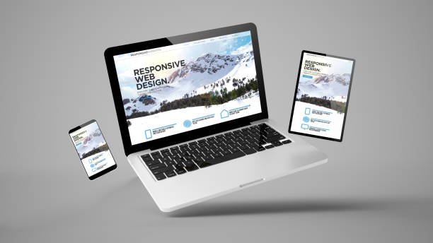
Responsive Web Design
This dynamic approach enables your website to shape-shift effortlessly, adapting to the screen size like a chameleon changing colors. It’s the key to ensuring that your site looks just as dashing on a 27-inch monitor as it does on a 5.5-inch smartphone.
-
Performance Optimization
Speed is the name of the game, and nobody likes a sluggish website. Optimize your performance to cater to users on all fronts. From optimizing images to leveraging browser caching, every millisecond counts. Remember, a fast-loading site is a happy site, and happy sites make for happy users.
-
Content Adaptation
Content is king, but its reign should be benevolent. Tailor your content for different devices. What works eloquently on a desktop might need to be more succinct on a mobile screen. Strike a balance between providing comprehensive information and not overwhelming the user.
-
UI and UX Considerations
Responsive UI design and User Experience (UX) are the dynamic duo of web design. The layout, color scheme, and navigation must be intuitive across devices. A button that’s easy to tap should be just as easy to click. Consistency is the golden thread that weaves through a delightful user journey.
-
Testing and Iteration
The unsung heroes of web design—testing and iteration. Regularly check how your website plays on various devices. Test, tweak, and test again. The digital world is a fast-paced race, and only the agile survive. Keep refining your design based on user feedback and emerging technologies.
The Final Thoughts
In this ever-evolving digital tapestry, the balance between Desktop-First vs. Mobile-First isn’t a one-size-fits-all equation. It’s an art, a dance, a symphony of pixels and code. Strive for a design that seamlessly caters to all users, regardless of the device they wield.
Summary of Key Points
- Understand user behavior and preferences for effective design.
- Embrace Responsive Web Design for a seamless cross-device experience.
- Optimize performance to keep your site speedy and accessible.
- Adapt content for different devices, balancing depth with brevity.
- Prioritize intuitive UI and UX across all screen sizes.
- Regularly test and iterate to stay ahead in the digital race.
Ready to embark on your design odyssey? Remember, the key is in the balance. Keep experimenting, stay user-centric, and let your website be a testament to the harmonious conjugal of Desktop-First and Mobile-First.
Enroll now in the Imarticus Learning Full Stack Developer course and unlock the door to a thriving career in web development. Don’t just dream about a job – guarantee it! Let’s dive into 6 months of immersive learning, mastering data structures, algorithms, and both front-end and back-end programming.
Join our web development certification course and be guided by a distinguished faculty through 350 hours of comprehensive instruction. Additionally, you benefit from an extra 100 hours exclusively dedicated to resolving any doubts that may arise during your learning journey.
Seize the opportunity – your journey to becoming a triumphant full-stack web developer begins here! Enroll today and script your path to success.