


Last updated on May 15th, 2026 at 03:07 pm
Data rarely speaks for itself. Numbers sit quietly in rows and columns until someone turns them into a picture the brain can understand in seconds. That is where Power BI visualizations step in. They translate data into shapes, colors, and movement that feel almost instinctive to read.
Think about how you check your phone battery. You do not read voltage numbers. You glance at a bar and know if you need a charger. That same mental shortcut is what good Power BI data visualization creates inside a business dashboard.
One glance should tell a sales head if revenue is healthy. One look should show an operations manager where delays are piling up. When visuals fail to do this, reports become decoration instead of decision tools.
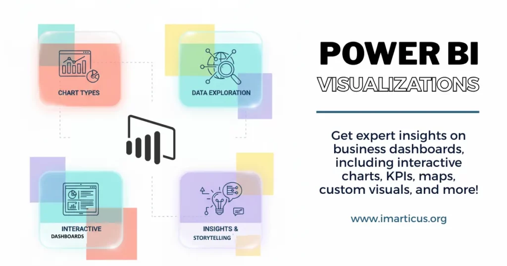
Most of us have seen dashboards full of charts, numbers, and colors. But when I open Power BI and begin choosing visuals, I treat it like designing a room. Every element must earn its place. The goal is to help someone see insights as clearly as they would see a friend’s face in daylight. When I talk about Power BI data visualizations in data science and analytics, I mean every graph, chart, KPI card, map, heatmap, or custom visual in Power BI that turns raw numbers into clear meaning.
As data volumes grow, attention spans shrink. Reports that demand long explanations rarely get used. Reports built with sharp, focused Power BI data visualizations become part of daily workflows. This guide walks through how to choose the right Power BI visualizations for different business questions, how to design dashboards that people understand in seconds, and how to move beyond basic charts into advanced and custom visuals. You will also see practical examples, real-world use cases, and best practices that make reports not just attractive but truly useful for decision-making.
Why Visuals Matter in Power BI
Before diving deeper into charts and patterns, it helps to understand what is Power BI and why it is widely used for turning raw business data into visual insights. Power BI is a business intelligence tool that connects to multiple data sources, transforms information, and presents it through interactive dashboards and reports.
Visuals act like windows into data. Words and numbers alone make the brain slow. A chart lets the brain detect patterns instantly. Let’s take this example. If you look at a table of monthly sales for a year, you see numbers like this:
| Month | Sales |
| Jan | 10,500 |
| Feb | 12,300 |
| Mar | 9,750 |
Numbers alone take time to process. But add a bar chart, and you see that February was stronger. That instant clarity is the power of data visualization using Power BI. Good visuals save time and reduce cognitive load.
Essential Types of Visualizations in Power BI
Power BI has many built-in options called Power BI visuals. You can also add more from the Power BI visuals marketplace or make your own custom visuals in Power BI when the default ones don’t fit your business needs. Here is a simple table showing common visuals and when to use them:
| Visual Type | Best Use Case |
| Bar Chart | Compare categories |
| Line Chart | Show trend over time |
| KPI Card | Highlight a single key metric |
| Map Visualization in Power BI | Geographical data |
| Matrix Visual in Power BI | Multi-dimensional table |
| Gauge Visual in Power BI | Show progress toward the goal |
| Heatmap Visual | Show density or intensity |
| Timeline Visual | Focus on time-based change |
Every visual tells a story. A bar chart makes categorical differences obvious. A line chart illuminates trends over time. A matrix visual Power BI feels like a smarter table that can group and drill into categories easily. These are core elements of Microsoft Power BI data visualization that help anyone from beginner to expert.
Many people hear the title “data analyst” but are not fully sure what the day-to-day work actually looks like. Getting a clear picture of the real responsibilities, tools, and impact of data analysts can help you understand whether this career path fits your interests and strengths.
Everyday Examples of Power BI Visualizations
Power BI visualizations are not limited to complex corporate dashboards. They mirror the kind of visuals people already use in daily life to understand information quickly. From tracking monthly expenses to monitoring fitness progress or comparing product performance, simple charts and indicators help make sense of numbers at a glance.
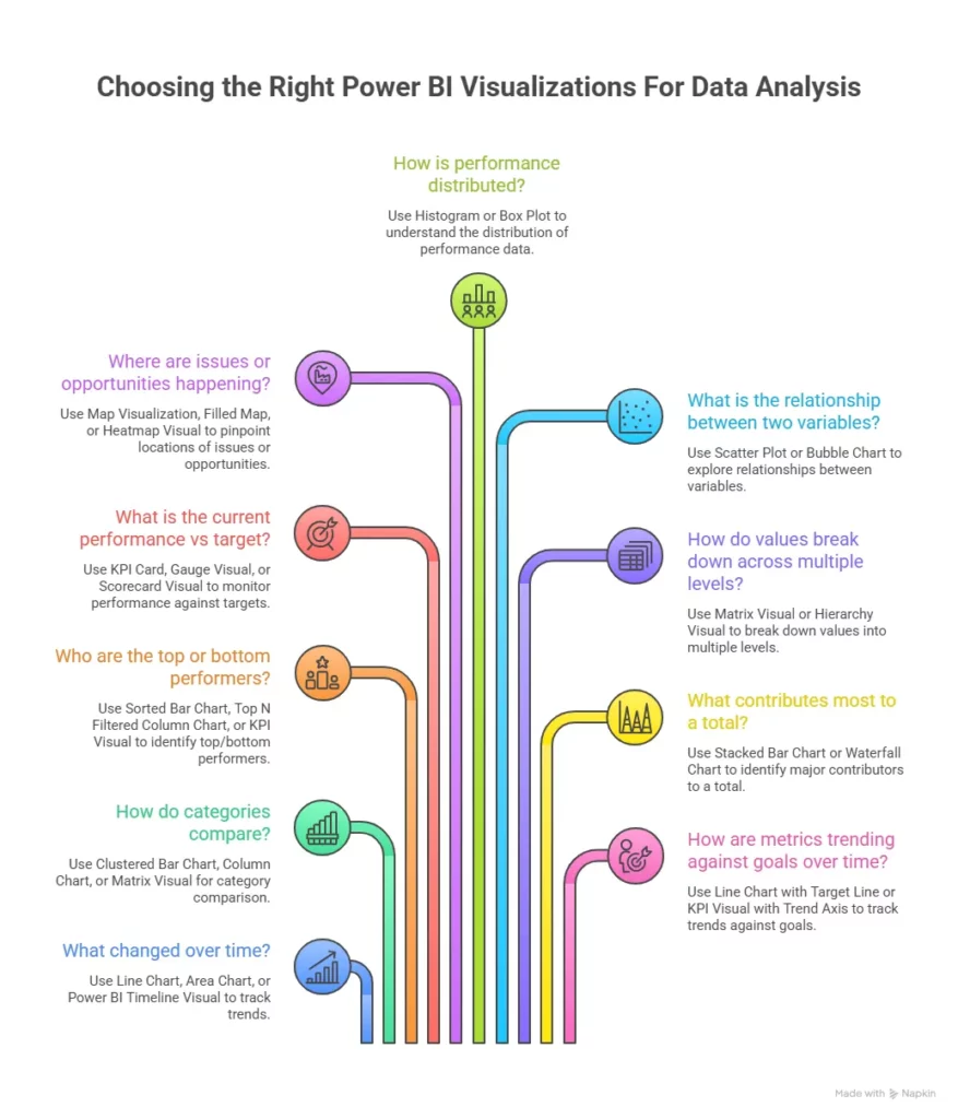
Tracking Week-Over-Week Web Traffic
To compare weekly web traffic, I chose a line chart. A line chart shows direction and velocity. Week 1 is 10,000 visits, and Week 2 is 12,000. On a table, these look like flat numbers. On a line chart, the upward slope makes growth obvious.
Seeing Top 10 Customers
When a business leader wants to see the top 10 customers by revenue, I use a top N bar chart sorted in descending order. It presents the top accounts at a glance. For the top 10 visuals in Power BI, you can use filters or slicers to highlight just those customers. The simplicity here helps decision makers focus on priorities.
Highlighting Progress to Monthly Goals
I use a gauge or KPI card to show progress toward a monthly target. A gauge visual in Power BI is like a progress meter on your phone battery. It is immediate and clear how close you are to full charge or your sales target.
These examples show how the Power BI visuals tutorial logic flows from the question to the right choice of visual.
Also Read: Top Power BI Projects You Can Start Learning Today
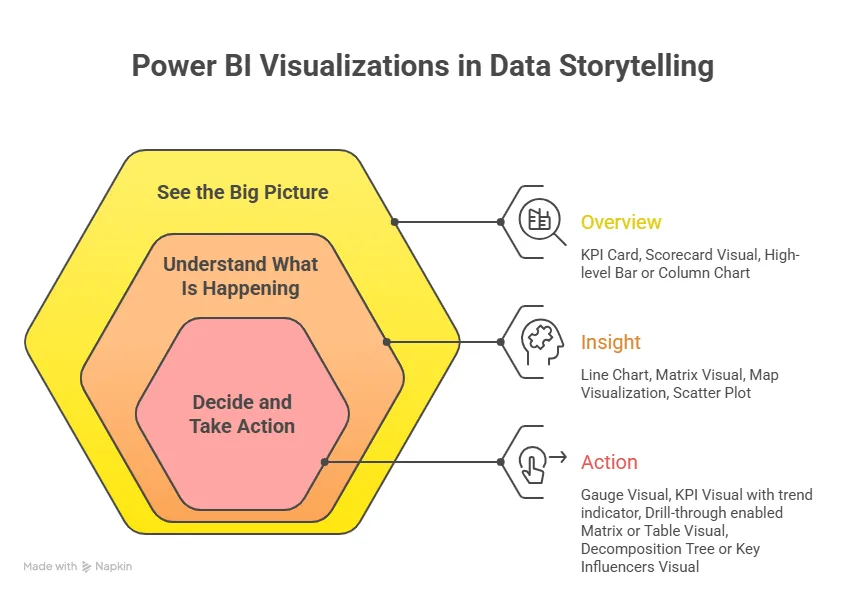
Seeing Data With Clarity Through Dashboard Layout
A Power BI dashboard is like a car dashboard. You want the speed and fuel gauge visible at once. You would not put the odometer reading beside a tiny map. A good dashboard shows only essential visuals on the first view, letting users dive deeper if needed.
When I design reports and dashboards, I test them by asking this simple question: “Can someone understand the key insights in five seconds?” This rule helps me focus on the heart of Power BI visualization examples that matter most.
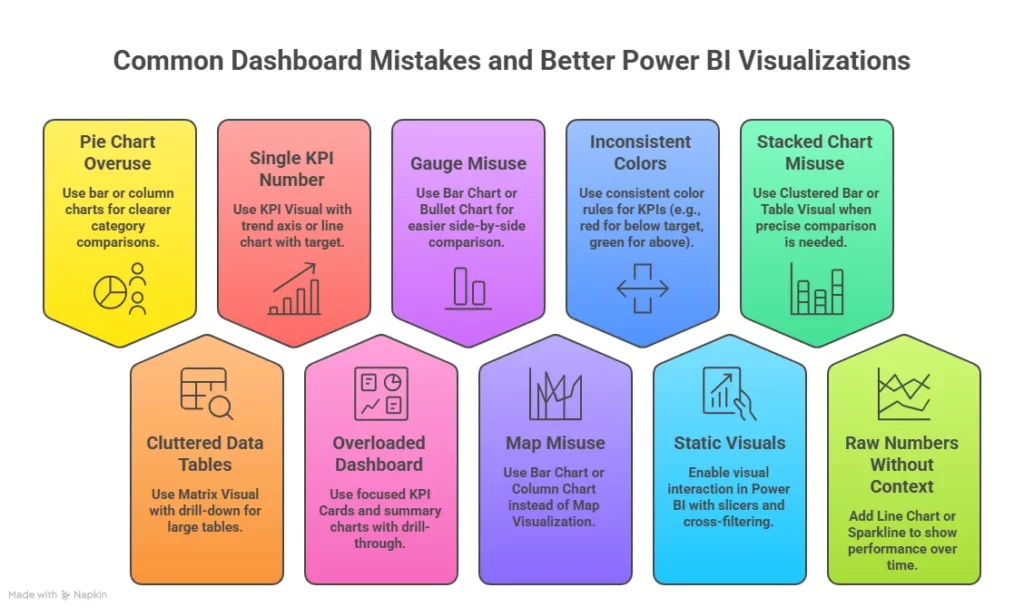
Adding Color and Clarity Without Confusion
Color matters in Power BI desktop visualizations. Choose a palette that feels calm and consistent, like a brand color scheme. Avoid loud rainbow colors unless they show essential differences.
In everyday life, a traffic light uses color wisely. Green means go, yellow means caution, and red means stop. In dashboards, use consistent meaning for colors so users instinctively understand without reading every legend.
Interactivity Means the Story Changes With a Click
One big advantage of Power BI is that visuals interact. If you click on a bar for one product, other visuals update. This makes powerful data visualization techniques and tools more alive. Users don’t just see data. They explore it. Filters, slicers, and drill-downs make this possible.
This interactive nature is part of Power BI for visualization. It is what sets it apart from static charts in presentations.
Where Built-In Visuals Might Not Be Enough
Power BI’s default visuals are powerful. But sometimes a business needs something unique. Let’s say a company wants a calendar visual in Power BI that shows team schedules with color coding. Or a scorecard visual for layered KPIs. These are use cases where Power BI custom visuals shine. You can find many ready-made ones in the Power BI visuals marketplace or build your own using developer tools.
Using custom visuals in Power BI means thinking beyond the defaults. You might download visuals for more complex waterfall charts or advanced network diagrams that you cannot build with default tools. These add depth and clarity to dashboards.
Also Read: Why Power BI is Essential for Data Scientists and Analytics Professionals?
Data Storytelling with Power BI Visualizations
Choosing the right visual is not random. The process I follow looks like this:
- Identify what question the audience is asking: Is it “Which product sold the most?” or “How did sales grow over the last year?”
- Pick visuals that match the question: For comparisons, bar charts work well. For trends, line charts are excellent. For a simple metric, a KPI visual in Power BI works.
- Avoid clutter: Too many visuals on a single page make the eye tired. Less is more.
- Check interactivity: Visuals should respond to clicks and filters. Users should feel in control, not confused.
These steps are part of Power BI data visualization best practices that help make dashboards intuitive and insightful.
Also Read: Interactive Dashboards with Microsoft Power BI
Building Advanced Power BI Visualizations
Once I move past basic charts, I focus on depth. This is where Power BI visualizations start to feel powerful and tailored. Many dashboards stop at bar and line charts. Real business questions often need richer layers.
I think of advanced visuals like tools in a kitchen. A knife works for many tasks. A blender, oven, and scale each solve different problems. The same applies to different visuals in Power BI.
Matrix Visual and Hierarchy Exploration
When data has multiple levels, a table becomes hard to read. A matrix visual in Power BI solves this. It lets users expand and collapse levels like folders on a computer.
Imagine sales data. You start with Region. Then Country. Then City. A matrix visual Power BI lets someone click and drill down. This feels natural. It mirrors how we explore files on a laptop.
The matrix visual is best for layered analysis, where users want to explore step by step.
When to Use Matrix vs Table
| Situation | Best Choice | Reason |
| Flat list of transactions | Power BI table visualization | Simple display |
| Sales by region and product | Power BI matrix visual | Expand and collapse groups |
| Budget by department and quarter | Matrix visual in Power BI | Multi-level structure |
This is a core part of analysing and visualizing data with Power BI. It helps users move from summary to detail without leaving the page.
Maps That Tell Location Stories
Location data needs visuals that match geography. A map visualization in Power BI helps answer questions like where customers live or where deliveries are late.
Think about food delivery. A manager wants to see delays by area. A Power BI map visual can show red circles where delays happen most. Patterns appear fast. A table of postal codes would not show this clearly.
There are different map styles available under the Power BI visualization tools. Below are common map styles and their use.
- Bubble Map shows volume by circle size.
- Filled Map colors regions like states or countries.
- Heatmap Visual shows density with color intensity.
These visuals help with data visualization in Power BI when geography matters.
KPI, Card, and Scorecard Visuals
Executives often want quick answers. They ask simple things.
→ Are we on target?
→ Did we grow?
→ Where are we behind?
This is where card visualization in Power BI and KPI visuals shines.
A KPI visual in Power BI shows a main number with a trend and target. A card shows just the number. A Power BI scorecard visual tracks multiple KPIs together.
Timeline and Calendar Visuals
Time-based analysis often needs more than a line chart. A Power BI timeline visual helps show project phases. A calendar visual in Power BI shows activity by date.
For example, HR may want to track employee leave. A calendar visual shows leave days clearly. It feels like looking at a wall calendar at home. These visuals support creating visualizations in Power BI that match how humans already understand time.
Relationship and Hierarchy Visuals
Some data is about connections. Who reports to whom? Which products belong to which category? A Power BI hierarchy visual or Power BI relationship visualization helps show these links.
Think of a family tree. You see parents, children, and siblings connected. The same logic works for company structure or product bundles. This type of Power BI graph visualization helps in network analysis and dependency mapping.
Also Read: 8 benefits of Power BI for businesses
Using Python and R for Advanced Visualization in Power BI
Sometimes, built-in visuals cannot handle complex statistical plots. That is when I use Python visualization in Power BI or Power BI R visuals.
Power BI allows scripts that generate visuals using Python libraries like Matplotlib or Seaborn. Python visuals are useful for advanced cases.
- Distribution plots
- Box plots
- Statistical trend analysis
- Machine learning output charts
These fall under advanced visualization in Power BI. They give analysts more control over visual output.
Visual Interaction in Power BI
A report becomes powerful when visuals talk to each other. This is called visual interaction in Power BI. Click on a bar for one product, and a line chart updates. Select a region on a map and a table filter. This feels natural. It is like filtering products on an online shopping site.
I configure interaction carefully.
- Select a visual
- Use edit interactions
- Choose filter, highlight, or none
This improves Power BI visualization best practices and reduces confusion.
Hiding and Showing Visuals for Better Focus
Sometimes I want to keep a visual for calculations, but not show it. Power BI allows you to hide visual in Power BI or hide column in table visual. This keeps the report clean. Users see only what matters. Behind the scenes, the logic still works.
For example, a complex table may calculate totals. I hide it and only show a summary card. This supports better Power BI desktop visualizations.
Importing and Downloading Custom Visuals
There are times when a built-in chart cannot meet business needs. That is when I look at Power BI visuals download options. You can import custom visual Power BI files or get visuals from the marketplace. Many are free. Some are premium.
Steps to add a custom visual.
- Open Power BI Desktop
- Click the three dots in the visuals pane
- Choose get more visuals
- Select and download Power BI custom visuals
This expands visualization tools in Power BI beyond defaults.
Performance Matters in Advanced Visuals
Complex visuals can slow reports. Large datasets plus heavy visuals increase load time. I follow simple Power BI data visualization best practices. Ways I keep reports fast.
- Limit visuals per page
- Avoid too many slicers
- Use aggregated data
- Reduce high cardinality fields
Fast reports mean better user experience and stronger adoption.
Careers in data are expanding fast, and many learners find themselves choosing between data science and data analytics as long-term paths. Understanding how these roles compare in skills, responsibilities, and growth opportunities can help you decide which direction aligns better with your strengths and career goals in 2026 and beyond.
Creating Custom Power BI Visualizations
When built-in charts are not enough, I turn to Power BI custom visuals. This is where creativity meets technical skill. Custom visuals help solve problems that default charts cannot handle.
Think about a retail chain that wants a shelf layout visual. Or a telecom firm that needs a network relationship diagram. These are not standard charts. They require custom visualization in Power BI.
What Are Custom Visuals in Power BI
Custom visuals are visuals built using code. They use web technologies like TypeScript and D3.js. These visuals run inside Power BI reports like any other chart. Microsoft provides tools to build and package them.
These visuals appear in the Power BI custom visuals marketplace. Users can also do a custom visual Power BI download and import files manually.
Why I Use Custom Visuals
Custom visuals help when business needs go beyond standard charts.
- Industry-specific charts
- Branded visual styles
- Advanced interactions
- Unique layouts like calendars or flow diagrams
These expand the scope of Power BI visualizations in enterprise dashboards.
Power BI Custom Visual Life Cycle
Every visual follows a process. The Power BI custom visual life cycle includes in order several stages from idea to deployment.
Power BI Custom Visual Life Cycle
| Stage | Description |
| Planning | Define what problem the visual solves |
| Development | Write code using Power BI visual tools |
| Testing | Validate with sample datasets |
| Packaging | Bundle the visual into a file |
| Deployment | Import into Power BI reports |
| Publishing | Submit to the Power BI visuals marketplace |
This full Power BI custom visual life cycle ensures the visual works reliably across reports.
Power BI Custom Visual CLI Tool Features
Microsoft provides command-line tools for building visuals. These are part of the Power BI custom visual CLI tool features. The tool helps create templates, run local tests, and package visuals. Common CLI commands help streamline development.
- Create a new visual template
- Start a local server for testing
- Package the visual for deployment
These tools support Power BI custom visuals development and make testing faster.
Creating Custom Visuals Step by Step
The process of creating custom visuals in Power BI follows clear stages.
- Install Node.js
- Install Power BI visuals tools
- Create a new project
- Write visual logic
- Test with sample data
- Package visual file
- Import custom visual Power BI into reports
This is how I handle how to create custom visuals in Power BI for advanced reporting needs.
The demand for data analysts continues to grow as organizations rely more on data-driven decisions. For anyone planning a career move in 2026, it helps to understand the practical steps involved, from building core skills in tools and statistics to working on real projects and preparing for job roles.
Best Power BI Custom Visuals to Explore
Some visuals from the marketplace are widely used. These visuals extend default capabilities.
- Advanced Sankey diagram
- Bullet chart for effective performance management systems
- Calendar heatmap visual
- Network relationship graph
Many offer Power BI custom visuals free download options that make experimentation easy.
Designing With Performance and Usability in Mind
Custom visuals should stay fast and easy to use. Heavy animations slow down dashboards. Clear labels and tooltips improve understanding. Good design improves Power BI visualization best practices and supports decision-making.
Real World Example of Custom Visualization
A logistics company wanted to see delivery routes. A map with animated paths helped show movement across cities. This was not possible with default Power BI visuals. A custom map visual solved it. This type of solution shows the strength of advanced visualization in Power BI.
The Imarticus Learning Advantage for Future Data Professionals
Visual skills form just one piece of the analytics puzzle. In the real world, leaders expect professionals who can not only create compelling dashboards but also link those visuals to business strategy, predictive insights, and automated data processes.
The Postgraduate Program in Data Science and Analytics by Imarticus Learning is designed to go well beyond individual tools and charts. It helps you develop a comprehensive, practical skillset that prepares you for real business challenges and high-impact roles in analytics.
Below are the key differentiators that learners consistently highlight as value drivers in this program:
- 100 % job assurance with 10 guaranteed interview opportunities at top companies hiring data science and analytics professionals.
- A GenAI-integrated curriculum that helps you master modern data science techniques and future-forward tools.
- Hands-on industry projects and internships that build real experience, not just theory.
- NSDC certification is recognised across industries and boosts professional credibility.
- Highest placement outcomes in the data science education space, supported by extensive industry partnerships.
- Curriculum spanning 35 + tools and technologies, including Python, SQL, Power BI, machine learning, and more.
If your goal is to move beyond learning individual components like visuals and dashboards and into end-to-end analytics capability, this program offers a pathway that connects classroom learning with real business value and career opportunity.
FAQs on Power BI Visualizations
Power BI visualizations often raise practical doubts once people start building real dashboards. Let’s now look at the most frequently asked questions around this topic so you can create reports that are clear, insightful, and built for better decision-making.
What are the visualizations in Power BI?
Power BI visualizations include charts, tables, maps, KPI cards, and custom visuals. These visuals turn raw numbers into meaningful insights. They help users understand trends, compare performance, and track goals. In business dashboards, Power BI data visualizations act like visual summaries that make decision-making faster and easier.
What is the best visualization for Power BI?
There is no single best chart. The best choice depends on the question being asked. Power BI visualizations work best when the visual matches the data story. Bar charts work well for comparison. Line charts show trends. KPI visuals highlight performance. Training programs at Imarticus Learning often focus on choosing the right visual based on business goals, which is a key part of mastering Power BI data visualizations.
What is the 5-second rule for dashboards?
The five-second rule means a user should understand key insights within five seconds of opening a dashboard. Power BI visualizations should be clear and focused so viewers quickly see what matters most. This improves engagement and reduces confusion during decision-making.
What is DAX in Power BI?
DAX is a formula language used in Power BI for calculations. It helps create measures and calculated columns that feed into Power BI visualizations. DAX allows deeper analysis, like growth rates, moving averages, and ranking logic that power dynamic visuals.
How to do a top 10 visual in Power BI?
To create a top ten chart, apply a filter on a visual and select the top N option. This limits results to the highest values. These filtered results feed into Power BI visualizations such as bar charts that clearly highlight top performers.
How do you create dashboards in Power BI?
Dashboards are built by combining multiple Power BI visualizations into a single view. Users pin visuals from reports to dashboards. This gives leaders a quick summary of KPIs and trends. Many analytics courses, including those at Imarticus Learning, teach dashboard design as a core skill.
What are the 4 visuals in Power BI?
Common foundational visuals include bar charts, line charts, pie charts, and tables. These basic Power BI visualizations handle many simple business questions and form the starting point for most reports.
What are the top 5 charts in Power BI?
Popular charts include bar charts, line charts, KPI cards, maps, and matrix visuals. These Power BI visualizations cover comparison, trends, performance tracking, geographic analysis, and detailed breakdowns.
Where Strong Power BI Visualizations Lead Next
Power BI visualizations turn raw data into something people can act on. Charts, maps, KPIs, and custom visuals all play a role in helping teams see patterns, track goals, and make faster decisions. When visuals are chosen with care, reports feel simple and natural to use. Users spend less time figuring things out and more time responding to insights.
Good Power BI data visualization always starts with a clear question. The visual should match the decision someone needs to make. A matrix helps explore layers. A map reveals location patterns. A KPI card shows performance at a glance. Custom visuals in Power BI extend this even further when business needs are unique.
As data grows, so does the need for better storytelling through Power BI visualizations. Skills in advanced visualization in Power BI, custom visual development, and performance optimization help professionals stand out. Learning how visuals connect with business problems builds confidence and career value.
For those who want to go deeper into data science and analytics, structured learning can make a big difference. Postgraduate Program in Data Science and Analytics offered by Imarticus Learning combines analytics, business thinking, and hands-on Power BI work, which can help bridge the gap between theory and real-world application.