Every company runs on numbers. Sales, customers, costs, growth. Someone has to read these numbers and explain what they mean. That role is the data analyst. When you take a Data Analytics Course in Bangalore, you learn how to do this work in a structured and simple way.
The path is not complex. You learn how to organise data. You learn how to pull data using SQL. You learn how to study patterns using Python. You learn how to present insights using dashboards. Each step builds on the last one. With practice, the work becomes natural.
This skill is in demand in Bangalore because companies need clear answers every day. They need to know what is working and what is not. They need to make quick decisions. This is why the Data Analytics Course in Bangalore have a placement focus on projects and real datasets. They prepare you for the kind of work that teams expect from day one.
This guide breaks down everything you need to know before choosing a Data Analytics Course in Bangalore. You will see what you will learn, the tools you will use, the types of courses available, fees and placement support, and the career paths you can pursue after completing the program.
Did you know?
According to a recent report by Naukri JobSpeak, analytics and data roles in Bangalore have seen consistent year-on-year growth of over 30%. This means companies need skilled people who can read data from multiple sources, clean messy data sets, build dashboards, and share insights in a simple way.
What Makes Data Analytics Such A High-Demand Skill
In daily life, we already use data. When you check your bank app to track expenses, you are using data. When you see your food delivery app suggest meals based on your past orders, that is data analysis at work. Businesses use the same idea but on a larger scale. They ask questions like:
→ Which product sells more on weekends?
→ Which city has the highest customer churn?
→ Which marketing campaign gives the best return?
A good data analytics course with placement in Bangalore trains you to answer such questions using data analytics tools and logic.
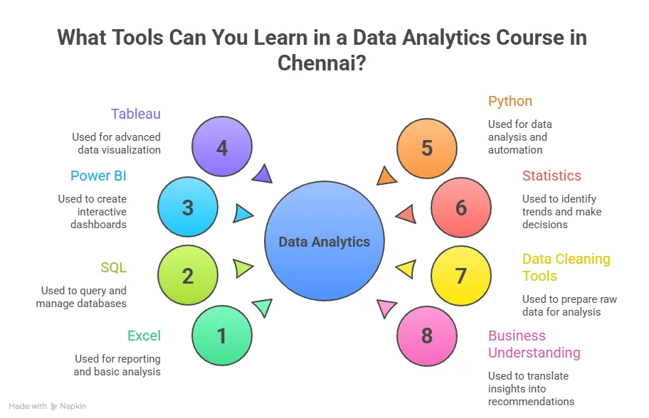
Tools Covered In Most Programs
Before you compare top data analytics courses in Bangalore, it helps to see the tools you will use in real jobs. Here is a simple breakdown.
| Tool | Use case in daily work |
| Excel | Quick analysis and reports |
| SQL | Pulling data from databases |
| Python | Handling large data and automation |
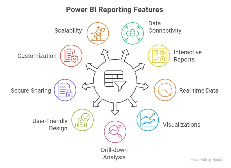
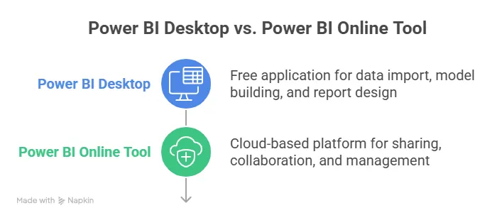
| Power BI | Building business dashboards |
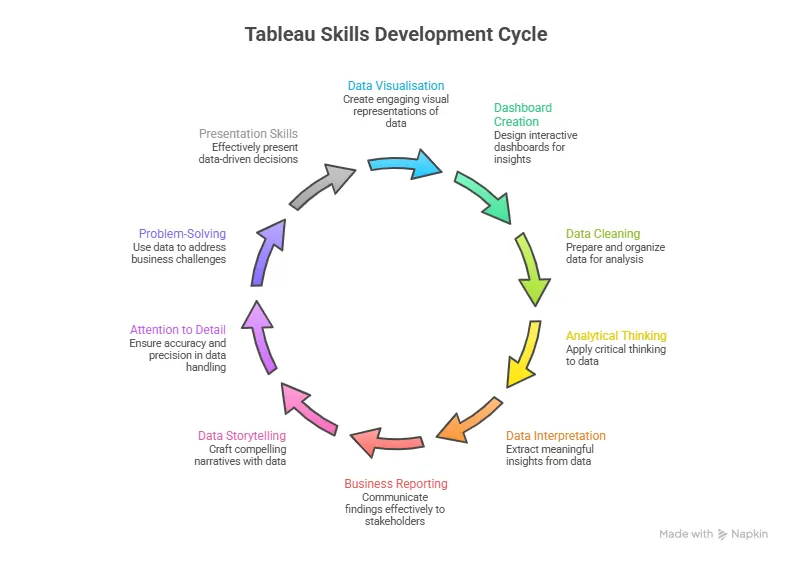
| Tableau | Visual storytelling |
| Google Analytics | Tracking web traffic |
Each tool has a clear role. A good data science and analytics course in Bangalore ensures you practice all of them through projects.
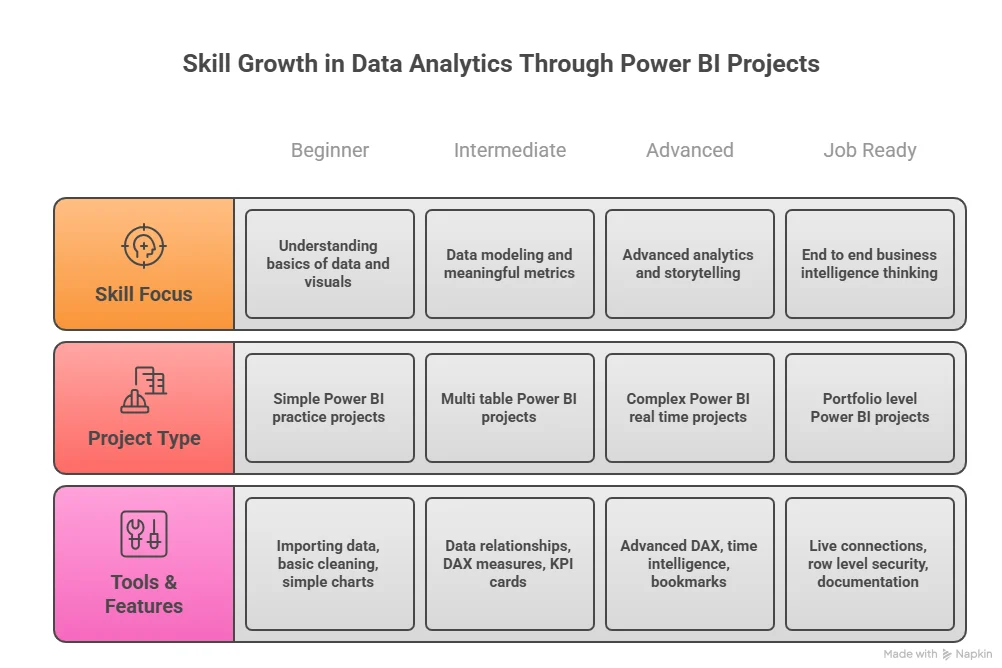
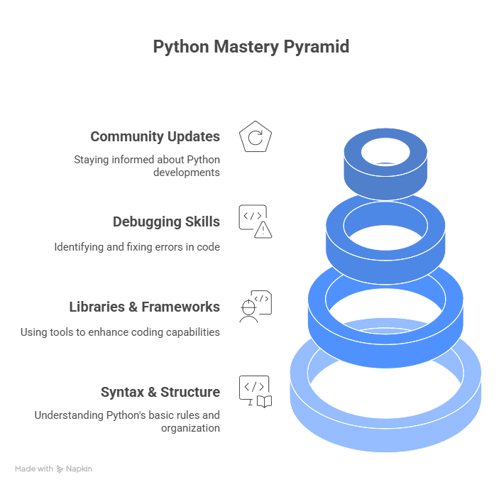
Skills You Build In A Data Analytics Course
Before choosing from the best data analytics courses in Bangalore, it helps to know what you will actually learn. Most strong programs focus on these data analytics skills layers.
- Data handling basics: You learn how to collect and clean data. This includes Excel, data cleaning rules, and error checks.
- Querying with SQL: SQL helps you pull data from large databases. You learn to filter, sort, and group data.
- Programming with Python or R: You use code to analyse large data sets and automate tasks.
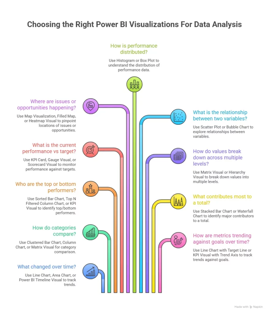
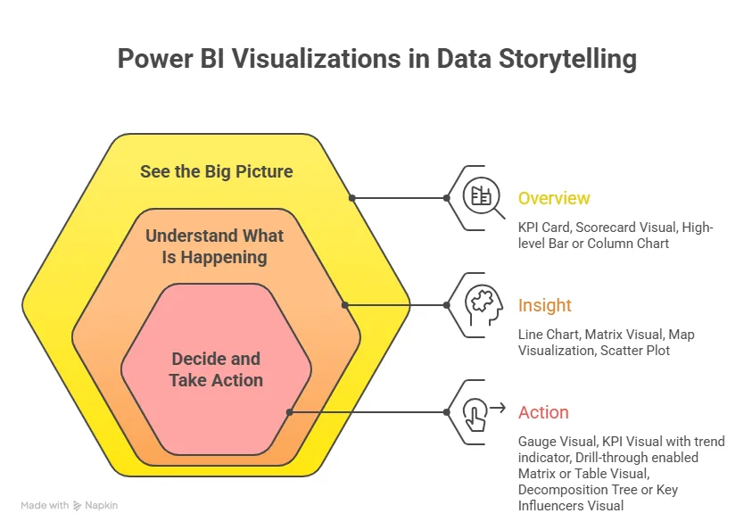
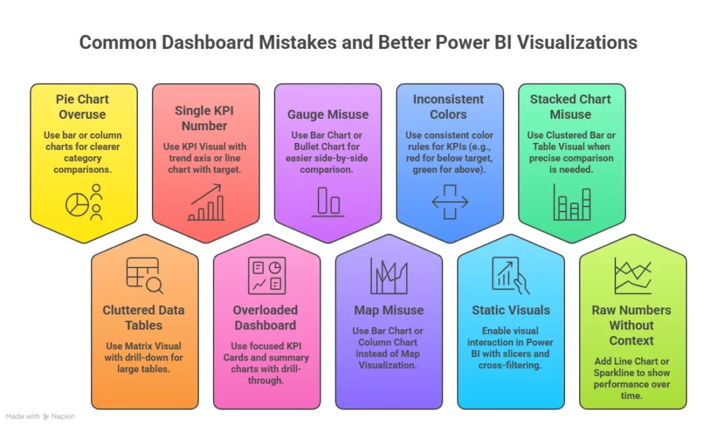
- Data visualisation: You build dashboards using tools like Power BI or Tableau.
- Business thinking: You learn how to connect numbers to real decisions.
These five layers form the core of most data analytics certification courses in Bangalore.
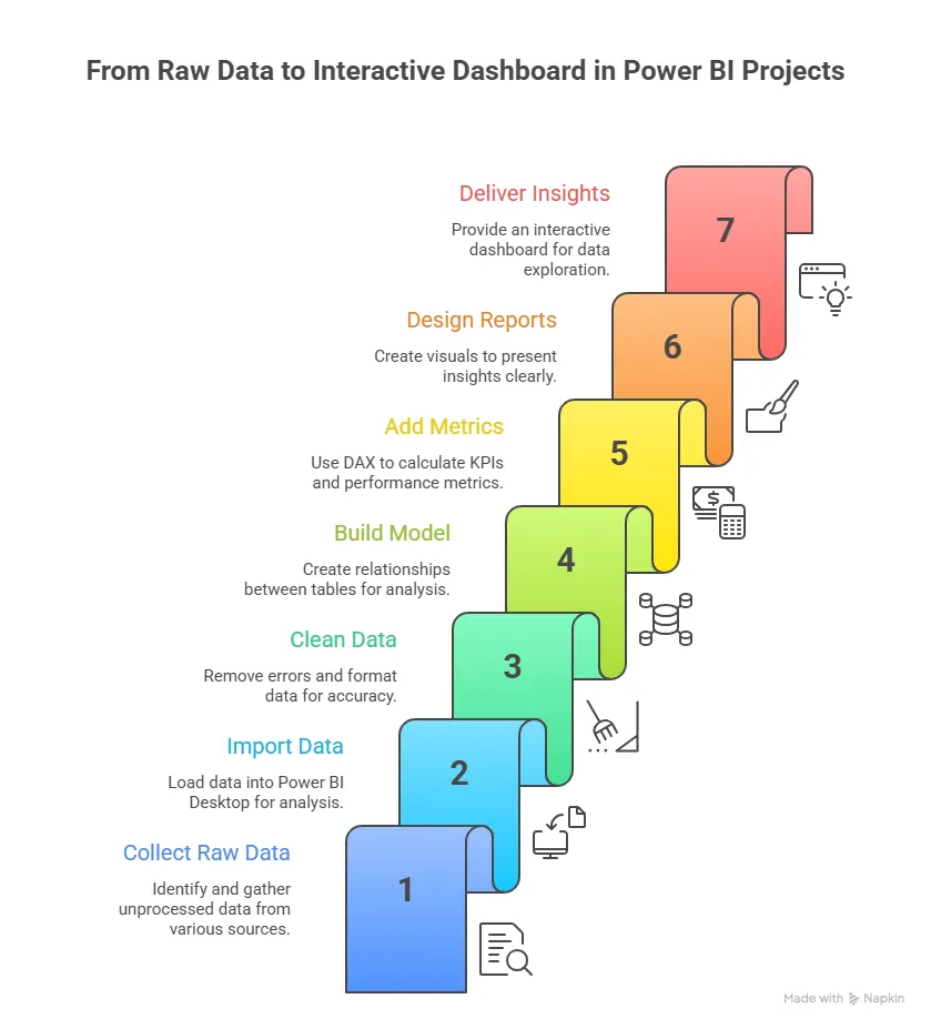
Understanding what a data analyst does in real work settings helps bring clarity before choosing a Data Analytics Course in Bangalore. The role usually involves data collection, cleaning, analysing patterns, and giving insights. Seeing how these daily tasks come together gives a clearer picture of what you can expect when you step into an analytics role.
Types Of Data Analytics Courses In Bangalore
Not every learner has the same goal. Some want classroom learning. Some want online flexibility. Some want fast career switch programs. This is how data analytics courses in Bangalore with placement are usually structured.
| Course Type | Learning Format | Best Suited For | Key Features |
| Classroom-Based Programs | Physical in-person sessions at a learning centre | Fresh graduates, students who prefer structured schedules | Live interaction with trainers, peer learning, live case studies, and lab sessions |
| Online Live Programs | Live classes are conducted online from home | Working professionals, career switchers | Flexible timings such as weekend or evening batches, real-time interaction, and access to recordings |
| Self-Paced Programs | Recorded sessions with a flexible schedule | Learners with tight schedules, self-learners | Learn at your own pace, flexible timing, independent study format |
Fast Track Career Transition Programs in Bangalore
These are intensive programs designed for quick career entry into analytics roles.
- Cover core tools like Excel, SQL, Python and dashboards in a short time
- Include multiple projects and case studies
- Offer interview preparation and placement support
- Focus on job readiness within a few months
These programs are ideal for graduates and professionals who want to move into analytics roles quickly.
However, data analytics placement support is usually limited here.
Also Read: How has Data Analytics Evolved Over the Years?
How To Choose The Best Data Analytics Course In Bangalore Step By Step
Selecting the right course needs a clear approach. Many options look similar at first glance. A simple step plan makes the choice easy.
Step 1. Define your goal
Start by asking yourself why you want to learn analytics.
- Do you want your first job?
- Do you want a career switch?
- Do you want to grow in your current role?
This helps you choose among the best data analytics courses in Bangalore based on your purpose.
Step 2. Check course depth
Look at the syllabus carefully. A strong Data Analytics Course in Bangalore should include:
- Data cleaning
- SQL queries
- Python basics
- Dashboard tools
- Business case studies
If any of these are missing, the course may not be complete.
Step 3. Evaluate the learning format
Decide if you prefer classroom or online learning. Some learners prefer the structure of data analytics classroom courses in Bangalore. Others prefer flexible online classes. Pick the format that suits your schedule.
Step 4. Compare fees with outcomes
Always compare the data analytics courses in Bangalore fees with the expected salary growth. If a course costs 1 lakh and helps you move from 3 LPA to 7 LPA, the return is strong.
Step 5. Check placement support
If your goal is a job, then choose data analytics courses in Bangalore with placement support.
Look for:
- Resume help
- Mock interviews
- Job referrals
Step 6. Check projects and portfolio
Real projects matter more than theory. A strong best to learn data analytics course in Bangalore includes at least 3 to 5 projects.
What You Should Check Before Choosing A Course
There are many best to learn data analytics course in Bangalore options in the market. Choosing one needs a simple checklist. Here is a practical way to evaluate any program.
| Evaluation Factor | What to Check | Key Details to Look For |
| Curriculum Depth | Check the syllabus coverage | Excel, SQL, Python, visualisation tools like Power BI or Tableau, and a capstone project |
| Placement Support | Check career support services | Interview preparation, hiring partner network, resume and LinkedIn profile support |
| Faculty Quality | Check trainer experience | Trainers with real industry exposure and practical analytics experience |
| Projects and Portfolio | Check hands-on learning | Real-world projects and case studies that help build a strong job-ready portfolio |
| Fees and ROI | Compare cost vs outcomes | Compare data analytics course fees in Bangalore with expected salary outcomes and career growth |
Also Read: What is the Impact of Data Analytics on Customer Experience and Engagement
Data Analytics Course Fees In Bangalore
The fees for a data analytics course in Bangalore vary based on the depth of learning and the level of career support offered. Short-term courses are a great starting point for building foundational skills, while comprehensive career-focused programs provide advanced training, real projects, and placement support to help you move confidently in your career in data analytics.
| Course type | Duration | Fees range |
| Short term | 2 to 3 months | 30,000 to 60,000 |
| Professional program | 4 to 6 months | 60,000 to 1,20,000 |
| Career transition program | 6 to 12 months | 1,20,000 to 2,50,000 |
You will see these ranges across most data analytics courses in Bangalore fees comparisons.
Certifications You Receive After Completion
Most data analytics certification courses in Bangalore provide certificates after course completion. These may include:
- Course completion certificate
- Project certificate
- Internship certificate
Some programs also help you prepare for global certifications. These certificates add value to your resume and LinkedIn profile.
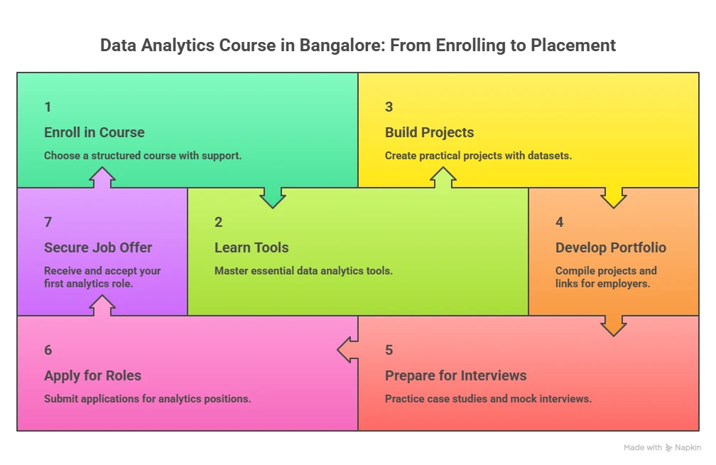
Planning your journey into data analytics becomes much easier when you see the steps laid out clearly from start to finish. Looking at the process in a structured manner helps you understand what to focus on at each stage as you prepare for a data analytics career.
Placements For Data Analytics Roles In Bangalore
Bangalore has one of the strongest hiring ecosystems for analytics roles in India. Startups, product companies, consulting firms, and global tech companies all hire data analysts on a regular basis. When someone searches for data analytics courses in Bangalore with placement, they are usually looking for a program that connects them with this hiring network.
Most good institutes have tie-ups with companies across sectors such as:
- E-commerce
- Fintech
- Healthcare analytics
- SaaS companies
- Consulting firms
This creates a steady flow of entry-level opportunities for learners who complete a data analytics course with placement in Bangalore.
Companies Hiring Data Analysts In Bangalore
The city hosts both global companies and fast-growing startups. Here are common categories of employers:
1. Product-based companies
These include companies that build apps, platforms, or SaaS products. They hire analysts for:
- Product usage data
- Consumer behaviour
- Feature performance
2. Consulting firms
These companies work with multiple clients and use data to solve business problems. They hire analysts for:
3. E-commerce and retail
Online retail companies rely heavily on data. They hire analysts for:
- Sales forecasting
- Customer segmentation
- Inventory planning
4. Startups
Startups need fast decision-making. Data helps them grow quickly. They hire analysts for:
- Growth tracking
- Marketing analytics
- Customer retention
A strong data science and analytics course in Bangalore prepares you to work in all these environments.
What Recruiters Expect From Freshers
Many learners think a certificate is enough. Recruiters usually look for more than that. After completing data analytics certification courses in Bangalore, recruiters check for three main things.
- Practical projects: They want to see dashboards and case studies.
- Business thinking: They want you to explain what your analysis means for business.
- Communication skills: They expect you to explain data in simple terms.
These three areas are well-built in top data analytics courses in Bangalore that focus on real-world projects.
Also Read: How Can Data Analytics Help You Become a Better Entrepreneur?
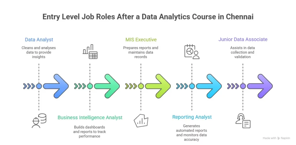
Career Growth Path In Analytics
Once you complete a Data Analytics Course in Bangalore, your growth path can look like this:
- Data Analyst
- Senior Data Analyst
- Analytics Consultant
- Data Scientist
- Analytics Manager
Each step adds more responsibility and a higher salary.
Salary Trends For Data Analysts In Bangalore
Salary is one of the biggest decision points for learners. According to Glassdoor India, the average base salary for a data analyst in Bangalore ranges from ₹5 LPA to ₹12 LPA, depending on skills and experience.
| Job Role | Fresher (0-1 year) | Mid Level (3-5 years) | Senior Level (5+ years) |
| Data Analyst | ₹4 – 6 LPA | ₹10 – 14 LPA | ₹14 – 20 LPA |
| Business Analyst | ₹5 – 7 LPA | ₹12 – 16 LPA | ₹16 – 22 LPA |
| Reporting Analyst | ₹3.5 – 5.5 LPA | ₹8 – 12 LPA | ₹12 – 16 LPA |
| Marketing Analyst | ₹4 – 6 LPA | ₹10 – 15 LPA | ₹15 – 20 LPA |
| Product Analyst | ₹6 – 9 LPA | ₹14 – 20 LPA | ₹20 – 30 LPA |
| Data Scientist | ₹8 – 12 LPA | ₹18 – 28 LPA | ₹28 – 45 LPA |
Key Observations
- Freshers who complete a Data Analytics Course in Bangalore typically enter the market between ₹4 and 6 LPA.
- Salaries grow quickly in the first 3 years with strong tool skills and project experience.
- Roles like Product Analyst and Data Scientist offer higher salary growth as you move ahead.
- Bangalore offers one of the highest salary ranges in India for analytics roles due to strong demand.
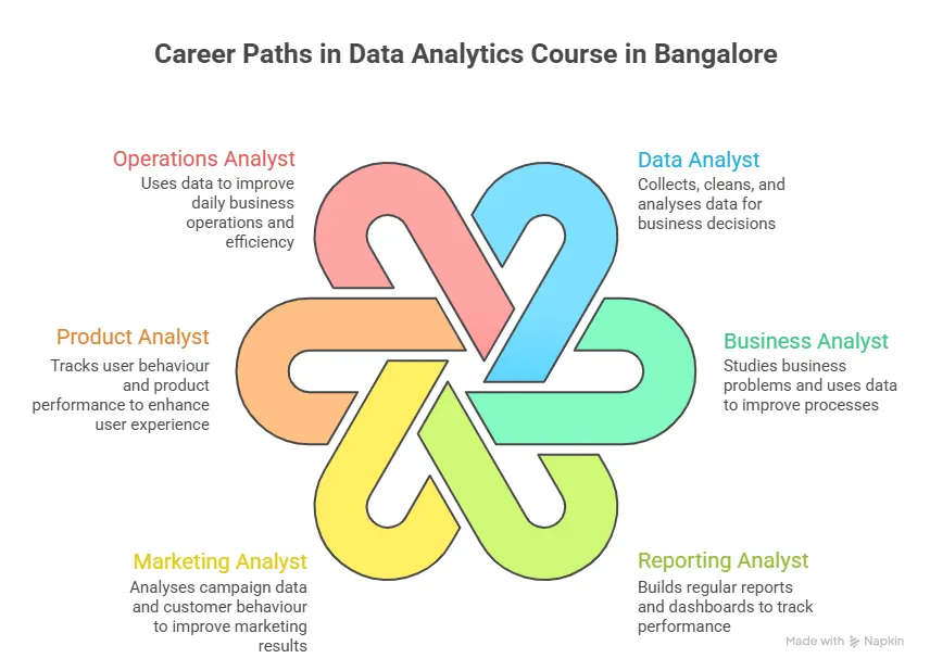
Getting a clear view of the data science career landscape in India helps you understand how different roles fit together and where data analytics sits within this broader field. It brings together key job roles, growth opportunities, and typical salary ranges so you can see how skills in analytics connect across industries.
Comparing Top Data Analytics Courses In Bangalore
Before selecting the best data analytics courses in Bangalore, a comparison table helps in quick decision-making. Below is a general comparison format that you can use when evaluating any institute.
| Feature | Short-Term Course | Professional Course | Career Transition Program |
| Duration | 2 to 3 months | 4 to 6 months | 6 to 12 months |
| Tools covered | Excel, basic SQL | Excel, SQL, Python, Power BI | Full analytics stack + ML basics |
| Placement support | Limited | Moderate | Strong placement support |
| Project work | Basic | Intermediate | Advanced capstone projects |
| Best suited for | Beginners | Graduates | Career switchers |
This type of comparison helps you choose among the best courses in Bangalore for data analytics based on your goals.
Online vs Classroom Data Analytics Courses In Bangalore
Both formats have their own advantages.
Classroom learning
Classroom programs give:
- Direct faculty interaction
- Peer learning
- Structured routine
These are common in data analytics classroom courses in Bangalore.
Online learning
Online programs offer:
- Flexible schedules
- Recorded sessions
- Access from any location
Many working professionals choose this format when looking for the best to learn data analytics course in Bangalore.
Also Read: How to Learn Data Analytics the Easy Way
Why Imarticus Learning stands out for a Data Analytics Course in Bangalore
When you evaluate different options for a Data Analytics Course in Bangalore, the difference usually comes down to how well the program connects learning with real career outcomes. Imarticus Learning’s Postgraduate Program in Data Science and Analytics is designed around this exact goal. The focus is not just on teaching tools, but on preparing you for actual analytics roles with structured training, projects, and career support built into the journey.
Here are the key elements that make the program strong and career-focused:
- Job assurance with structured placement support: The program offers job assurance along with guaranteed interview opportunities, helping learners connect directly with hiring companies in the analytics domain.
- Guaranteed interview opportunities with top companies: Learners receive access to multiple interview opportunities with hiring partners, which helps accelerate entry into analytics roles.
- Large hiring partner network: The institute has a wide network of hiring partners across industries, which supports consistent placement opportunities for analytics roles.
- Hands-on projects and internship experience: The program includes real-world projects and internships that allow learners to work on business problems and build practical skills.
- Training across 35 + tools and technologies: The program covers a wide set of analytics tools and technologies that are used in real jobs, helping learners build complete skill coverage.
- NSDC recognised certification: Learners receive a certification that is recognised across industries and adds credibility to their analytics profile.
These features show how the program connects learning with actual job outcomes. When you compare data analytics courses in Bangalore with placement, this type of structure helps ensure that your time and effort lead to real career opportunities in the analytics field.
FAQs On Data Analytics Course In Bangalore
Choosing the right Data Analytics Course in Bangalore often comes with the most frequently asked questions around fees, course quality, tools, and career outcomes. The answers below address these common doubts in a simple and practical way.
What is the cost of a data analyst course in Bangalore?
The cost of a Data Analytics Course in Bangalore usually ranges between ₹30,000 and ₹2,50,000, depending on course duration, depth, and placement support. Short courses are more affordable, while career transition programs cost more due to advanced tools and placement services. Institutes like Imarticus Learning offer structured programs that include projects and career services, which add to the overall value.
Which college is best for data analytics in Bangalore?
The best institute for a Data Analytics Course in Bangalore depends on your learning goals. Some learners prefer university programs while others choose industry-focused institutes. Imarticus Learning is often considered a strong option due to its industry-aligned curriculum, project work, and placement support that prepare learners for real job roles.
Which course is best for data analytics?
The best choice is a Data Analytics Course in Bangalore that covers Excel, SQL, Python, and visualisation tools, along with real projects. Courses that also provide placement support and industry exposure are more useful because they prepare you for actual job requirements in Bangalore’s analytics market.
What are the 4 types of data analysis?
The four main types taught in a Data Analytics Course in Bangalore are descriptive analysis, diagnostic analysis, predictive analysis, and prescriptive analysis. Each type answers a different business question, such as what happened, why it happened, what may happen next, and what action should be taken.
What is the salary of a data analyst at Google?
A candidate who completes a Data Analytics Course in Bangalore and later joins a company like Google can expect high salary packages depending on experience and skill level. According to data from Glassdoor, data analysts at top tech companies can earn between ₹12 LPA and ₹30 LPA or more based on experience and role.
Can I learn data analytics in 3 months?
Yes, it is possible to complete the basics of a Data Analytics Course in Bangalore in about three months if the program is intensive. Short-term programs cover Excel, SQL, and basic dashboards. However, greater skills and job readiness usually require longer programs with projects and placement support like those offered by Imarticus Learning.
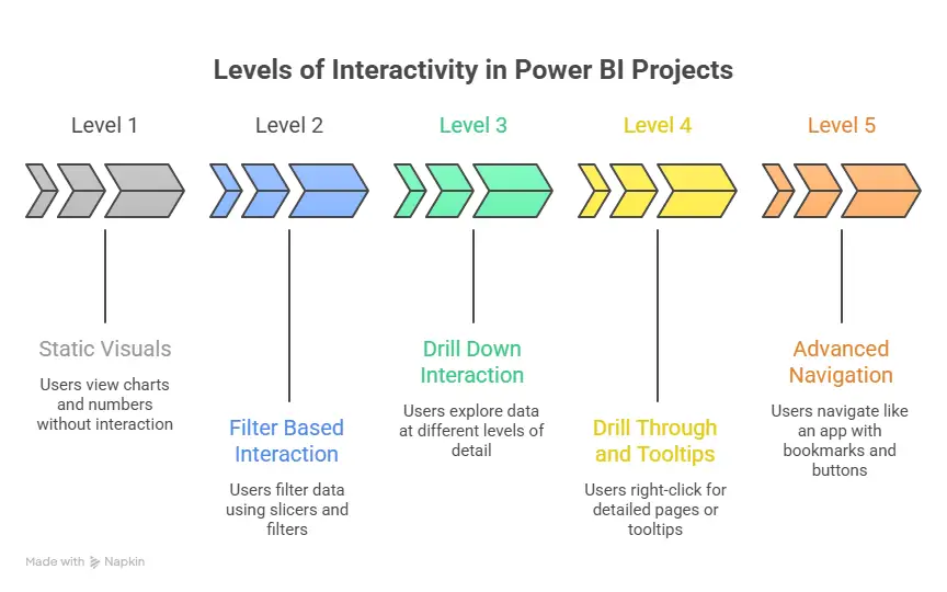
What are the 5 levels of data analytics?
The five levels covered in a Data Analytics Course in Bangalore include data collection, data cleaning, data analysis, data visualisation, and decision making. Each level builds on the previous one and helps convert raw data into useful business insights.
What software is used in data analytics?
The most common tools taught in a Data Analytics Course in Bangalore include Excel, SQL, Python, Power BI, Tableau, and sometimes R programming. These tools help analysts collect, process, and present data in a clear format for business use.
Making The Move Into Data Analytics In Bangalore
Every search for a Data Analytics Course in Bangalore begins with a clear intent. You may want a stable career, a higher salary, or a role where you can solve real business problems. That intent deserves a plan that is simple and focused.
Start with your goal. Decide the kind of role you want in the next 6 to 12 months. Then pick a learning path that builds the right mix of skills and projects. Keep your effort steady. Daily progress in Excel, SQL, Python, and dashboards adds up fast. When you build two or three solid projects, your profile starts to speak for you.
Bangalore rewards people who can show real work. A clear portfolio, clean dashboards, and simple explanations can help you stand out in interviews. Keep your resume short and clear. Show your projects. Share what problem you solved and what insight you found. This is what hiring teams look for when they scan profiles for data analytics courses in Bangalore with placement outcomes.
As you move forward, look for a program that gives you structure, feedback, and career support. A guided path can help you stay on track and reach interviews faster. If you want a program that blends industry projects, mentoring, and placement support, you can explore the Postgraduate Program in Data Science and Analytics from Imarticus Learning as you prepare for your analytics journey. Take a small step today and keep it consistent. That is how a simple intent turns into a strong career in data analytics.