


Last updated on May 15th, 2026 at 03:07 pm
Data is everywhere today. But insight? That’s still rare. Most organisations don’t fail because they lack data – they fail because they don’t see what the data is trying to tell them. Numbers exist, but clarity doesn’t. Reports get created, dashboards get shared, yet the real question often remains unanswered: “So, what should we do next?”
This is where Power BI reporting steps in.
Instead of staring at endless spreadsheets or static charts, Power BI helps you understand what’s actually happening in your business – quickly, clearly, and with context. It connects the dots between numbers, trends, and outcomes. Whether you’re tracking sales, analysing finance data, or monitoring performance, Power BI turns raw data into stories people can actually follow and act on.
Through real-world projects, hands-on Power BI reporting practice, and guidance from industry experts, the Post Graduate Program in Data Science & Analytics helps you move beyond just using tools – it trains you to think like a data professional and communicate insights that actually influence decisions.
In this blog, I’ll break down what Power BI reporting really is, how reports differ from dashboards, the different types of reports you can build, and best practices to design reports that don’t just look good – but deliver real insights.
Did you know?
Most reports don’t fail because the data is wrong – they fail because they’re hard to understand or arrive too late. Power BI reporting fixes this by making insights easy to see and easy to act on.
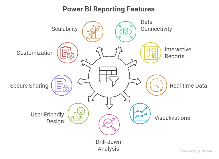
What Exactly is Power BI Reporting?
Many people often wonder: What is Power BI, and what exactly are Power BI reports? Power BI reporting is basically about making data easier to deal with. Most businesses have data sitting in different places, and pulling it together usually means spreadsheets, manual work, and a lot of confusion. Power BI simplifies that by putting everything into one report that actually makes sense.
These reports aren’t fixed or boring. You don’t just look at them and move on. You can click around, filter numbers, and dig deeper when something doesn’t look right. If a sales number jumps or drops, you can explore it instead of guessing why it happened.
So yes, Power BI is a reporting tool. But it doesn’t feel like traditional reporting. It’s built for everyday use – for managers, teams, and decision-makers who want clear answers without spending hours figuring out the data.
In short, Power BI reporting helps you see what’s going on and understand it well enough to act on it.
Before we dive deeper into Power BI reporting, here’s a quick video that walks you through how data science and data analytics fields compare and where tools like Power BI fit into real data careers.
Power BI Reporting vs Dashboards
This is one of those questions almost everyone asks at the start: What’s the difference between a report and a dashboard in Power BI? And honestly, it’s a fair question.
Here’s the easiest way to think about it.
- Power BI reporting is where you spend time. They’re detailed, usually spread across multiple pages, and meant for digging in.
- You click, filter, and explore. If a number looks off and you want to know why, you open a report.
- Dashboards are the opposite. They’re quick. One page. Just the key numbers and charts pulled from different reports.
- You open a dashboard to get a feel for how things are going, not to analyse every detail.
- That’s why people often talk about Power BI dashboards vs reports.
- An interactive dashboard shows you what’s happening. A report helps you understand what’s behind it.
In real life, companies don’t choose one over the other. They use both. Leaders glance at dashboards to stay updated, while teams use reports to analyse problems and make decisions. Used together, they make Power BI far more useful than either one on its own.
Quick insight:
When teams rely only on summaries, important details get missed. That’s why businesses that use Power BI reporting vs dashboards together tend to make faster and more confident decisions – dashboards give the snapshot, while reports provide the depth needed to act.
Types of Power BI Reports
There’s no single “right” Power BI reporting. It really depends on who’s using it and what they’re trying to figure out.
Some reports are meant for everyday use. These are the ones teams open regularly to keep things on track – sales numbers, stock levels, attendance, or open orders. They’re practical and straightforward, answering the question: Is everything okay right now?
Other reports are built for digging deeper. These help people spot patterns, compare performance, and understand what’s changing over time. When someone asks, “Why did this suddenly drop?” or “What’s driving this growth?”, this is the kind of report they turn to.
Finance teams use Power BI reporting to look at profit and loss, budgets, expenses, and costs without relying on static monthly files.
| Report Type | What it’s used for | Example |
| Operational Reports | Day-to-day tracking and quick checks | Daily sales, inventory levels, attendance |
| Analytical Reports | Finding trends and understanding changes | Month-on-month growth, performance comparisons |
| Financial Reports | Reviewing financial health and costs | P&L statements, budgets, and expense analysis |
| Management Reports | High-level decision-making | KPIs, summary dashboards for leadership |
If you’re new to Power BI, the easiest way to understand all this is to look at real examples. Browsing Power BI report examples and Power BI sample reports shows how actual businesses use data, structure their reports, and tell a clear story. You don’t need to copy them – just notice what feels easy to understand and what doesn’t.
Power BI Facts:
Power BI reporting is the process of turning raw business data into interactive, visual reports that help users understand trends, track performance, and make better decisions. Instead of static spreadsheets, Power BI reports allow users to filter, drill down, and explore data in real time.
How to Create a Report in Power BI
If you’re thinking about how to create a report in Power BI, don’t overthink it. Most people assume it’s complicated before they even open the tool and then realise it’s actually quite logical.
- You start by bringing in your data. That might be an Excel sheet you already use, a database, or some online system.
- Then you spend a little time cleaning it up – fixing column names, removing things you don’t need, and making sure the data makes sense.
- This part is more about common sense than technical skill.
- Next, you build the report by dragging fields onto charts and tables.
- You try things out, move visuals around, add filters, and slowly the picture becomes clearer.
- When a number looks strange, you click into it.
- When a chart works, you keep it. It’s very hands-on.
Once the report tells a story you’re happy with, you publish it so others can see it online and interact with it themselves. No more sending versions back and forth or wondering who has the latest file.
That’s why Power BI reporting feels approachable. You don’t need to be an expert – you just need to start and learn as you go.
| Step | What you do |
| Connect data | Bring in data from Excel, databases, or cloud apps |
| Clean the data | Fix names, remove errors, and organise it using Power Query |
| Build visuals | Drag fields onto charts and tables to create visuals |
| Add filters | Use slicers and filters to explore the data |
| Review & refine | Adjust visuals and check the story the data tells |
| Publish report | Share the report online through the Power BI service |
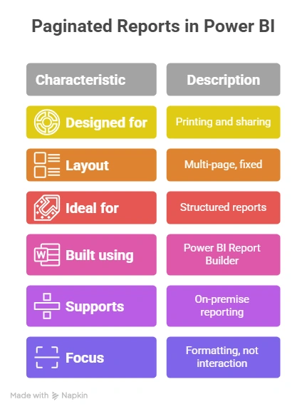
Special Case: Paginated Reports in Power BI
Not every report is meant to be clicked around. Some reports are meant to be printed, shared as PDFs, or sent as formal documents. That’s where paginated reports in Power BI make sense.
A paginated report spreads data neatly across multiple pages, just like the reports people have used for years. Nothing gets squashed onto one screen. This makes them ideal for things like invoices, statutory reports, or detailed financial statements where layout and structure matter.
- To create these reports, you use Power BI Report Builder. It’s a separate tool that lets you control how the report looks on each page – margins, spacing, headers, footers, and page breaks.
- If your organisation works mainly with on-premise data, Power BI Report Server lets you host and manage these reports securely within your own systems, without depending on the cloud.
Simply put, paginated reports are for situations where the report needs to look right when printed or shared – not just when viewed on screen.
If you’re thinking beyond just Power BI reporting tools and want to build a full data career, here’s a short video worth watching that shows how structured learning can help you go from beginner to confident professional in today’s data-driven world.
Power BI Report Design Best Practices
Great insights can still fail if the design is confusing. A good power BI report design focuses on clarity, not decoration. Some simple best practices that you should follow:
- Keep layouts clean and uncluttered.
- Use consistent colours and fonts.
- Choose visuals that match the data story.
- Highlight key numbers first.
- Avoid overwhelming users with too many charts.
Well-designed Power BI reports guide the viewer naturally from question to insight.
Power BI Report Templates & Examples
If you don’t want to start Power BI reporting from zero, using Power BI report templates can be a big help. It saves time and keeps reports consistent, especially when you have to process data with multiple teams.
Looking at real Power BI report examples is also a great way to learn. You start to see how experienced users structure their reports, choose the right visuals, and guide people through the data visualisation without overwhelming them with data and records.
That’s why many organisations create their own libraries of Power BI sample reports. Instead of rebuilding the same reports again and again, teams can reuse designs that already work and adapt them to their needs.
In short, templates and examples help you move faster – and build better reports with less effort.
Here are a few popular Power BI report & dashboard templates that you can use:
| Category | Sample Power BI Template Names |
| Sales & Revenue | Sales Performance Dashboard Template |
| Marketing & Digital | Marketing Campaign Dashboard Template |
| Finance & Accounting | Financial Reporting Template |
| Operations & Supply Chain | Operations Performance Report Template |
| Management & KPIs | KPI Dashboard Template & Executive Summary Dashboard Template |
| HR & Workforce | HR Analytics Report Template & Employee Attendance Report Template |
| Ecommerce & Projects | E-commerce Sales Dashboard Template & Employee Attendance Report Template |
| Customer Insights | Customer Insights Dashboard Template |
Did you know?
A Power BI dashboard shows a quick snapshot, but Power BI reporting is where real analysis happens. Dashboards tell you what’s going on; reports help you understand why.
Why Choose Imarticus for Power BI Reporting
Learning Power BI reporting isn’t just about tools – it’s about knowing how businesses actually use data. Imarticus focuses on practical, job-oriented learning that connects reporting concepts with real-world decision-making.
With industry-aligned training, hands-on projects, and expert guidance, learners don’t just learn Power BI reporting; they learn how to think like data professionals.
What you get with Imarticus Learning:
- Use Power BI reporting on real datasets – Spend time analysing data that looks and feels like what companies use every day – not cleaned-up textbook examples.
- Build reports from start to finish – Go through the full reporting flow, from understanding the business question to presenting insights clearly.
- Learn how tools fit together – See how Power BI works alongside data cleaning, analysis, and presentation – the same way it happens in real jobs.
- Think from a business point of view – Focus on why a report is built, not just how to use Power BI reporting, so insights make sense to managers and stakeholders.
- Gain confidence through practice – Learn by doing repeatedly, not by just watching videos or copying steps.
For learners who want to go beyond reporting, Imarticus also offers a Postgraduate Program in Data Science and Analytics, designed to build strong foundations in data analysis, visualisation, and business problem-solving – skills that employers actually look for.
FAQs About Power BI Reporting
Power BI reporting brings up a lot of common questions – especially if you’re new to data or just starting to explore reporting tools. From understanding what Power BI can and can’t do to knowing how it’s used in real jobs, these frequently asked questions cover the things people usually want clarity on before getting started.
What does Power BI reporting actually mean?
Power BI reporting lets you turn data into visual reports that show patterns, trends, and problems clearly. Good reporting helps you answer questions like What’s working? What’s not? And what should we do next? That’s why Power BI reporting has become such a big part of how modern teams make decisions. Institutes like Imarticus Learning help you get hands-on training with real projects that help you showcase skills in your portfolio and resume.
What types of Power BI reports are commonly used in companies?
There isn’t just one kind of report used by organisations. Businesses use different types of Power BI reports depending on their needs. Some reports track daily operations like sales or inventory. Others focus on performance trends, KPIs, or management insights. Finance teams rely heavily on Power BI for budgets and cost tracking, while leadership teams use summary reports to guide strategy. The flexibility is what makes Power BI reporting useful across departments.
What are paginated reports in Power BI?
Paginated reports in Power BI are used when reports need to look formal and structured. These are the kind of reports you’d want to print or export as PDFs – like invoices, detailed financial statements, or compliance reports. A paginated report in Power BI shows all rows of data and breaks content across pages, unlike interactive reports that focus on exploration.
What is Power BI Report Builder?
Power BI Report Builder is a tool used specifically to create paginated reports. If your job involves fixed-format reports where layout really matters, Report Builder is the right tool. It gives you precise control over spacing, alignment, and pagination – something standard Power BI reports aren’t designed for.
How hard is it to create a report in Power BI for beginners?
If you know basic Excel and understand your data, you can start building reports pretty quickly, and it’s much easier than most people expect. Learning how to create a report in Power BI mainly involves connecting data, choosing the right visuals, and arranging them logically. As you grow more comfortable, you can use advanced calculations and better design, but beginners can still create useful reports from day one.
What is Power BI Report Server used for?
Power BI Report Server is mainly for organisations that don’t want to store their data in the cloud. It allows companies to host Power BI reports and paginated reports on their own servers. This is common in industries with strict data security rules. It gives teams the benefits of Power BI reporting while keeping everything on-premise.
Are Power BI templates and sample reports actually useful?
Yes – especially when you’re learning. Power BI report templates and Power BI sample reports show you how experienced professionals structure reports. Looking at Power BI report examples can save you hours of trial and error. They give you ideas for layouts, visuals, and storytelling that you can adapt to your own data.
Can Power BI be used for financial reporting and serious business analysis?
Absolutely. Financial reporting in Power BI is one of the most common real-world use cases. Teams use it for budgets, forecasts, profit and loss statements, and performance tracking. What makes Power BI reporting powerful is that finance teams don’t have to wait weeks for static reports – they can explore numbers in real time and respond faster to changes.
Why Power BI Reporting Is a Skill Worth Investing In
Data isn’t slowing down, and the need for people who can actually make sense of it keeps growing. Power BI reporting has become one of those practical skills that sits right at the heart of everyday business decisions. Companies don’t just want dashboards anymore. They want people who can explain what the numbers mean, spot changes early, and help teams act on insights.
Spending time learning Power BI reporting isn’t just about adding another tool to your list. It’s about building a skill that stays useful across roles, industries, and career stages. Whether you’re just starting, thinking about a career switch, or trying to move into more strategic work, this ability gives you a real advantage.
But moving beyond surface-level reporting takes more than just watching tutorials. The way you learn matters. Hands-on work, real datasets, and guidance from people who’ve actually used Power BI in business make a big difference. That’s where the Post Graduate Program in Data Science & Analytics fits in – helping learners turn concepts into skills they can actually use on the job.
If working with data genuinely interests you, and you want to build a career around it, this is a good place to start. Don’t just learn Power BI – learn how to think through problems, analyse information, and communicate insights like a data professional.