Last updated on July 2nd, 2024 at 02:38 pm
Last Updated on 2 years ago by Imarticus Learning
Multivariate data visualisation is an invaluable instrument for illuminating convoluted relationships and patterns within datasets.
Researchers and analysts need to get insights, make educated decisions, and effectively convey findings.
In essence, multivariate data consists of several variables or qualities, each with its own set of values, creating a multi-dimensional puzzle.
Data scientists use a variety of visual tools, such as scatter plots, heatmaps, and parallel coordinate graphs, among others, to uncover hidden gems.
These visualisations give a complete picture of data relationships, allowing the detection of correlations, trends, and outliers, much like experienced cartographers charting unidentified territories.
This blog will delve into methodologies, best practices, and real-world applications that examine various elements of multivariate data visualisation.
If you want to have a booming career in data science or take up a data science course, keep reading to learn in detail about multivariate data visualisation.
What is Multivariate Data Visualisation?
The graphical depiction of data sets that include several variables or characteristics is multivariate data visualisation.
It is a critical tool for data analysis and exploration, allowing analysts and researchers to acquire a better grasp of complex relationships within multidimensional data.
In a nutshell, multivariate data visualisation extends data beyond numbers and tables, transforming it into accessible and informative visual representations. It enables for the simultaneous evaluation of numerous variables using charts, graphs, scatter plots, heatmaps, and other visual approaches, revealing patterns, trends, and correlations that would otherwise be buried in raw data.
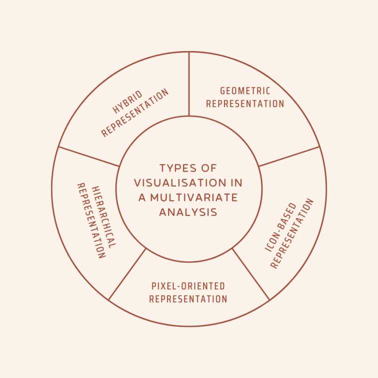
Types of Visualisation in a Multivariate Analysis

Data visualisation with multivariate analysis has its classifications. While making a career in data science and analytics, this knowledge will be useful.
1. Geometric Representation
Geometric representation is an important type of visualisation in multivariate analysis. Techniques like scatter plots, parallel coordinate plots, and multidimensional scaling are utilised for transforming complicated data into geometric forms and patterns.
These visualisations enable analysts to get useful insights and make well-informed choices by allowing them to explore links, clusters, and sequences within multidimensional data.
2. Icon-Based Representation
In multivariate analysis, icon-based representation is a visual approach that uses symbols or icons to convey information about data points.
Each icon’s characteristics, such as size, colour, or structure, indicate specific characteristics entitling rapid and intuitive comprehension of complicated data links.
This form of visualisation simplifies understanding data and is suitable for expressing multivariate ideas simply.
3. Pixel-Oriented Representation
Pixel-oriented representation is a type of visualisation used in a multivariate analysis that uses individual pixels organised in a grid to represent data points.
The colour or intensity of each pixel indicates distinct features or values, allowing analysts to see patterns and variances in the collection.
This method provides a particular visual perspective, which is beneficial for studying vast and complicated datasets, where pixel-level details can reveal deep linkages and nuances.
4. Hierarchical Representation
Hierarchical representation, in multivariate analysis, organises data in a hierarchical, layered format. It uses tree diagrams or layered structures to illustrate changeable relationships.
This visual technique facilitates recognising hierarchical patterns within datasets, allowing the discovery of connections and subgroups among variables, and increasing the depth of analysis and comprehension in complicated multivariate data.
5. Hybrid Representation
Hybrid representation in multivariate analysis combines numerous kinds of visualisation methods, such as scatter plots, bar charts, and heatmaps, to offer a complete picture of complicated data sets.
This strategy improves comprehension of multiple variable interactions by harnessing the capabilities of numerous visual tools, allowing analysts to extract key insights and patterns more effectively.
Why Conduct Multivariate Data Visualisation?
While getting a data analytics course or a data science course, one might wonder what is the need for conducting multivariate data visualisation.
One might often have this as a part of their data science training. Read to know about it in a simplified manner.
- Comprehensive representation: Multivariate data visualisation gives an extensive overview of complicated datasets, allowing analysts to comprehend subtle relationships and patterns among various variables.
- Pattern Recognition: It facilitates the detection of hidden patterns, correlations, and trends that would otherwise be missed by numerical analysis alone.
- Outlier Detection: Visualisation aids in the rapid identification of outliers or abnormalities in data, which is critical for quality control or anomaly detection activities.
- Effective transmission: Visual representations make complicated data more accessible and clear to varied stakeholders by simplifying the transmission of results.
- Decision Support: By providing facts in a simple and usable style, it enables decision-makers to make educated choices.
Steps to Apply Multivariate Analysis for Data Visualisation
While doing a data analytics certification course, the learner often comes across the methodology to apply multivariate analysis for data visualisation. They are:
Step 1: Data Preparation
Begin by collecting and cleaning the data, resolving missing values and outliers, and ensuring that it is in an analysis-ready shape.
Step 2: Variable Selection
Select the variables or qualities that are significant to the study, taking into account their influence on the research question or aims.
Step 3: Data Reduction
When working with high-dimensional data, use techniques such as Principal Component Analysis (PCA) or Factor Analysis to decrease dimensionality while keeping crucial information.
Step 4: Visualisation Methods
Based on the data and objectives, choose appropriate multivariate visualisation approaches. Scatter plots, heat maps, and parallel coordinate graphs are all popular possibilities.
Step 5: Encoding Variables
To effectively depict their relationships in the chosen visualisation, map the selected variables to visual qualities like colour, size, or location.
Step 6: Interactive Tools
Implement interactive components in the visualisations to allow viewers to dynamically explore the data and gain deeper insights.
Step 7: Pattern Recognition
Examine the visualisations for patterns, trends, clusters, or outliers in the data.
Step 8: Interpretation and Communication
Interpret the insights acquired by visualisations and successfully communicate findings to stakeholders via reports or presentations.
Step 9: Refinement
Iteratively improve the visualisations and analyses in response to feedback and new research questions, ensuring that they remain aligned with the shifting objectives.
Step 10: Documentation
To ensure transparency and repeatability, document the whole multivariate analysis process, including data sources, techniques, and outcomes.
Conclusion
Multivariate data visualisation is an essential tool for unravelling complex and significant data. It allows the researchers to extract useful insights and make informed decisions. It connects data and knowledge enabling an effective communication system in different domains. This kind of visualisation plays a significant role in exploratory data analysis and research.
Check out Imarticus Learning’s Postgraduate Programme in Data Science and Analytics to become a data analyst.
This programme will give you 100% job assurance with chances to upskill yourself. It is both for fresh graduates and early career professionals, so anyone can join this data analytics course in india with placements. Get in touch via chat support on our Contact Us page. Alternatively, visit one of our training centers in Mumbai, Thane, Chennai, Pune, Bengaluru, Delhi, Gurgaon, or Ahmedabad.
Related Posts:

