Advantages of data visualization with tableau certification

There are several prospects for Tableau professionals. It was formerly a data visualization suite, but you can see the data management add-on in its latest version. As a result, the need for Tableau experts is increasing rapidly. If you are still unconvinced about the benefits, it can offer to your career; this is the post for you.

What is Tableau?

Tableau is the business intelligence industry’s fastest-growing data visualization platform. It assists you in converting textual and numerical data into visual dashboards that allow people to see and comprehend their data. Tableau’s dynamic, simple, quick, and user-friendly design has made it highly popular. The beautiful thing about Tableau is that it does not require any technical or programming knowledge to operate. 

The Advantages of Completing Tableau Course

If coding isn’t your thing, but you want to work in an exciting field, being a Tableau specialist is an excellent choice. Furthermore, even if you have no technical capabilities, you may become a qualified professional. You have to choose the tableau training certification and start creating the groundwork for your profession. So, here are some considerations for deciding whether or not to study Tableau.

Tableau coursestableau courses 
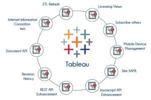
provide several sorts of visualization possibilities. This improves the overall user experience. Tableau is simpler to learn than Python.

Those with no coding skills or understanding may also rapidly learn Tableau. Users may construct an extraordinarily interactive visual representation using Tableau’s drag and drop features.

Tableau can easily manage millions of rows of data. You may use significant volumes of data to generate various sorts of visualizations without interfering with the functionality of the dashboards. 

Additionally, Tableau has a ‘live’ option for connecting to other data sources such as SQL. Tableau Dashboard provides an excellent reporting tool to tailor the dashboard to devices such as smartphones or laptops. 

Future Roles in Tableau Professionals

Analytics knowledge and Tableau proficiency may propel you to the top of your field. We live in a competitive technological world driven by innovation and transition. Big Data, Artificial Intelligence, Machine Learning, Deep Learning, Cloud Computing, and the Internet of Things are just a few of the technologies permeating practically every sector to grow even more in the future. When seen through an analytics platform like Tableau, these developments may give rise to many jobs.

The need for Tableau professionals is expanding all the time. Thus more people are deciding to add this ability to their toolbox. The most effective method to accomplish this is to get Tableau training and certification from a reputable and competent training source.

Learn tableau course with Imarticus Learning

This tableau course will teach students to apply data science in the real world and build complicated models that yield critical business insights and projections.

Course Benefits for Learners:

  • Students should be familiar with data analytics, machine learning principles, and the most popular data science tools and methodologies.
  • To achieve a tableau certification, students must complete 25 real-world projects and case studies led by corporate partners.
  • Data visualization using tableau software is one of the most in-demand skills in today’s industry. Therefore fresh graduates and early-career professionals should consider enrolling.

Contact us through chat support, or drive to one of our training centers in Mumbai, Thane, Pune, Chennai, Bengaluru, Delhi, and Gurgaon. 

A Step-By-Step Guide To Tableau Charts

A Step-By-Step Guide To Tableau Charts

Tableau is a platform for data visualization that enables you to develop interactive dashboards, reports, and data visualizations. The tool’s straightforward drag-and-drop interface makes it simple to link your data and create stunning images. Tableau offers many different types of charts and graphs. You can create them using Tableau’s standard data visualization tools or with more advanced features.

What Is Tableau?

Tableau is a business intelligence (BI) software that allows you to create data visualizations easily and quickly. With Tableau, you can visualize your data in various formats like maps, charts, and graphs. You can go from raw numbers to fully fledged reports within seconds. 

corporate leadership

Learning Tableau charts can help you make visual data more engaging. It’s a great way to share your findings with the world and make them easier to understand.

Tableau allows users to create interactive visualizations from their data without writing code. Users can create dashboards, reports, and other interactive visualizations with Tableau.

Tableau charts show data in an easy-to-understand format. You can use them in conjunction with traditional charts like bar graphs and line graphs to show the relationship between sets of data points.

Here are some steps that will help you create a great chart with Tableau:

First, you need to identify the data table. You can do this by using the “Get External Data” option in Tableau Desktop or the Get External Data button on the View menu of Tableau Server. In either case, select the table you want to analyze and click OK.

Once you have identified the data table, it is time to create your visualization. To do this, double-click on your data source in Tableau Desktop or select New Visualization from the View menu in Tableau Server. You will be prompted for some information about your visualization (like whether or not it should be interactive) and then given a chance to choose between different types of visualizations.

Once you have chosen which type of visualization you want to create, go ahead and fill out any other optional settings, such as whether or not your visuals will get linked and how many times they should get refreshed each second (this is important if there are any delays between updates from live data sources). 

Learn tableau course with Imarticus Learning

In this tableau course, a student will learn to become a data analyst in the real world and create complex models that produce essential business insights and forecasts.

Course Benefits for Learners:

  • Students will learn Data analytics, machine learning fundamentals, and the most widely used data science tools.
  • To receive a tableau certification, students must finish 25 real-world projects and case studies directed by corporate partners.
  • One of the sought-after abilities in the market today is the ability to visualize data utilizing a Tableau program. Therefore, recent graduates and those just starting their careers might consider enrolling.

Contact us through chat support, or drive to one of our training centers in Mumbai, Thane, Pune, Chennai, Bengaluru, Delhi, Gurgaon, or Ahmedabad.

Tableau V/S Excel: Who Will Win?

 Tableau V/S Excel: Who Will Win?

The debate has been on for so long that no one remembers when and where it all began. But the question has always remained the same—is it better to use tools such as Excel or Tableau for analysis?

 Some people say that Tableau can easily beat Excel in anything. Some say the contrary side. Tableau and Excel are two practical tools for creating, developing, storing, and analyzing data. Businesses use both, but they have different features and functions. This post will look at some of the fundamental differences between Excel and Tableau.

The Basic Differences between Excel and Tableau

Excel is a 20-year-old software program that works with numbers. Tableau, in contrast, was explicitly designed for data analysis and visualization. The two programs also have different use cases; Excel works well when you perform calculations and generate reports based on your data, but it may not be as flexible as Tableau if you need to create interactive dashboards and narratives. Tableau allows users to drag-and-drop fields into visualizations, meaning they can customize their output much more quickly than Excel.

Why use Tableau when you can use Excel?

Excel is the most popular and influential application, especially when it comes to data visualization. Excel has been helping people create and analyze data for more than three decades now, making it one of Microsoft’s best products.

 But, despite Excel’s dominance in tech circles, there are many reasons people are starting to use Tableau instead, at least for specific tasks. Users say that their companies save about 30 percent on their monthly business intelligence costs using Tableau instead of Excel. 

Why use Excel instead of Tableau?

Tableau and Excel are currently two of your best options for data visualization software. Both of these programs have their unique benefits and drawbacks. Excel is one of Microsoft’s most popular tools because it’s free and works with all files (including PDFs, XMLs, and HTML files). You can use Excel for various purposes, like creating documents or analyzing numbers. 

However, using Excel on its own is not very efficient when creating beautiful infographics or advanced data visualizations. Instead, you need to use an add-on program like Adobe Illustrator or Microsoft Powerpoint, which requires more time and money for less sophisticated results.

Both have pros and cons in the ongoing war between Microsoft Excel and Tableau. Some say that Tableau has taken the tech world by storm with its easy-to-use functionality, while others believe that Excel still has a few tricks.

Learn data analytics online with Imarticus Learning

This placement assured tableau course will educate students on applying data science in the real world and creating complex models that produce crucial business insights and forecasts.

Course Benefits for Learners:

  • Learners should be familiar with data analytics, machine learning principles, and the most popular data science tools and approaches.
  • Students participate in 25 real-world projects and case studies conducted by corporate partners to obtain a tableau certification.
  • Data visualization with the tableau program is among the most in-demand abilities in today’s market, so recent graduates and early-career employees should consider enrolling.

Contact us through chat support, or drive to one of our training centers in Mumbai, Thane, Pune, Chennai, Bengaluru, Delhi, and Gurgaon

Power up with a micro-credential in data analysis with a tableau course in 2022

Power up with a micro-credential in data analysis with a tableau course in 2022

Like W. Edwards Deming once said, “Without data, you’re just another person with an opinion.” Data is the future and the driving force of today. They say knowledge is power and data is knowledge. It is the information that reforms civilizations and fabricates unfathomable technology, propelling whoever uses the insights data extracts strategically into leading positions.

It is the fuel that is running the world today and building a scientifically maneuvered tomorrow. Data hold answers to the most complex disciplines and gives you the power to back your opinion with evidence-based analysis. In a world continually engaged in cutthroat competition, data is the only differentiator. The interpretation of data is a powerful instrument that steers every decision that is made today. 

What is data analysis?

Data analysis is a systematic approach governed by logical and statistical techniques that help in the extraction of insights via gathering, modeling, and inspecting data to pilot informed conclusions and factually accurate decisions. It helps you collect relevant information and identify the pain points to come up with viable solutions depending on your field of work. 

What is a micro-credential?

If you are someone who wants to upskill without devoting the time and cost it needs to commit to a full degree, then micro-credential is an option that will most definitely interest you. Devised to provide you with the resources be it theoretical or practical, micro-credentials cater to your specific requirements to advance your skills. Micro-credentials act as independent credentials adding to your academic merit. 

What is tableau

Tableau is an intuitive, visual analytics computerized program that helps in easing the process of analysis by converting big data into simpler and more accessible forms. It turns complex data into a smaller version that is easily comprehensible and gives accurate insights into the small data at the same time. 

With data at our fingertips, the influx of it has been high and businesses around the world need a system that is easier to operate while giving an interactive experience to the users. It has become instrumental in inspecting data all while giving a deep intuitive understanding of it. 

Why Tableau 

This visual tool has become an integral part of corporations and its easy-to-use design has propelled companies to expand their business using this software. Not only is it detail-oriented but also gives you an in-depth knowledge of the steps you need to take to augment your project. 

The success of corporations today depends on data visualization and examination. These prerequisites present your opportunities to practically apply your skills and create a promising career. As businesses expand, the inflow and need to explore and interpret larger numbers of data will increase. 

Tableau career prospects

Here are the diversified career options you can choose from after completing the course:

  • Data analyst
  • Business intelligence analyst
  • Tableau consultant
  • Business intelligence manager
  • Business analyst
  • Business intelligence developer

Why choose a micro-credential in data analysis with a tableau course 

From the complexities of linear regression to linear discriminant analysis, the tableau course covers all the essentials you need to transform you into an expert in this field. 

  • Higher employability – As the world advances, data has become the oil that drives the corporate world into expansion. The demand for analysts to collect, clean, model and inspect data to give viable solutions in tandem with their augmentation plans has become a necessity. The program comes with guaranteed job interviews  opportunities apart from transforming you into an adept data analyst. Certification in data analytics course also helps you in upskilling and venturing into your own line of innovation.

  • Job-relevant skills – The course familiarizes you with theoretical as well as practical knowledge that ensures you develop job-relevant skills. Mentored and guided by industry experts and professionals, you get to participate in real-world case studies and projects.

  • Extensive support – The course focuses on the development of every single individual enrolled in the program and assists them every step of the way from preparing them for placements, workshops, mock interviews, and providing expert career guidance. 

Conclusion

Our micro-credential in data analysis with a tableau course covers the crux of the topic as well as its complexities of it so that you can provide real-time solutions to clients and establish a successful career in this profession. As someone proficient in developing tableau and extracting detailed cognizance from it, you can aid businesses excel and creating futuristic solutions for corporate problems. 

Visualizing Spotify data with a tableau course

Visualizing Spotify data with a tableau course

Data science has emerged as a very demanding trend in the industry. Domain skills bring valuable insights from structured and unstructured data using standard tools and techniques.  One of the aspects of data science is data visualization, which is called the graphical representation of the main information obtained from the processed data.

Tableau 

Tableau is one of the standard tools in business intelligence, analytics, and data visualization.  Tableau (desktop and, more recently, public) versions have changed how we interact with visualization and developed data stories for visual communication aids for our large stakeholders, including non-technical audiences globally. With Tableau, you can visualize Spotify streamed data of your favorite artists, tracks, brands, and more. 

You can create dynamic dashboards for visualizing data by using the streaming data and API requested from Spotify and integrating it into the Tableau tool. 

Tableau to Visualize Spotify Music

Once you connect to the Spotify page, you can download music data from the top charts. Top 200 options get a top track or trending track. Use the pull-down menu to filter by country or select Global Options. Similarly, choose from daily or weekly data for your analysis. Use the “Download to CSV” option at the top right of the screen. Daily data is downloaded in the default Spotify_Daily_Streaming file.

Analyze

Now in the Tableau application, load the data source. To open the latest Spotify CSV file on the canvas, select the “Text File” option in the Connect pane. Use the Tableau options to analyze the uploaded data.

The following sections are summarized to analyze the given clause.

Popular Tracks and Artists

Follow the steps to get the most famous songs.

  • Create a new sheet.
  • Add the SUM to rows.
  • Track URL to columns.
  • Sort the songs in the order of greatest to lowest.
  • Enter a name for the track. It is provided next to the Track URL on columns.
  • Using the pill in the columns hide the Track URL title.
  • Mark the Show Header option unchecked.

  Popularity by country

This option is used to analyze how listening habits vary from country to country.

  • Double-click the Country column in the Data panel. Being a geographical area, it plots data on a map. The tableau indicates the geographical column that placed the data on the map.
  • Drop the Streams column into the color for creating a map. For multiple streams, the color turns black.
  • For less than two streams are indicated in a lighter shade.
  • The right-most side of the screen displays unknown values.
  • Double-click on the error notification to remove the data.
  • Use the filter to get the Global column. 

Streaming songs or artists

  • Add the “Week” to rows.
  • Also, add the SUM to columns.
  • You need to filter the Global data.

 You can also analyze currents over time by adding consecutive “week (date)” in columns and SUM (streams) in rows. Of course, in-depth analysis like “seasonality” can be done in the table and allows customized analysis.

Bring to Dashboard

Just drag the sheets from the above analysis with the default map. Select the “Use as filter” option on the map and bar chart. Finish the map’s visual presentation settings with color, grid, and format options.

Data Analytics Certification

It is convenient for new graduates with nearly 5 years of industry experience to upgrade with Visualizing Spotify Data for new graduates and with a tableau course designed for career professionals in data analytics. Imarticus Learning also offers you a PG degree in Data Analytics and Machine Learning.

 You become stronger with the foundation of data analytics and machine learning concepts and with the most in-demand data science tools and processes to play a better role in the data science domain. With the Data Analytics course, you can master skills in data visualization as well as Python, SQL, data analytics, and machine learning for data visualization. To get more information about courses in analytics, contact us through chat support, or drive to our training centers in Mumbai, Thane, Pune, Chennai, Bengaluru, Delhi, and Gurgaon. 

Tableau: Accelerating Decision-making with the Power of Visual Analytics!

Tableau is one of the most frequently used data analytics tools. It is used for data visualization where the data is represented in a pictorial or graphical form. The raw data is converted into an understandable format by Tableau which can be further used for data analytics.

Firms use Tableau to understand the data and to use data analytics for empowering their business. Tableau helps in decision-making via forecasting, analytics, risk assessment, etc.

Let us see more about Tableau and how it helps in decision making & data visualization.

Importance of Visual Analytics

Visual analytics is the analytical reasoning of data via interactive visual interfaces which in this case is Tableau. Visual analytics helps in understanding the data better, finding outliers in the dataset, discovering insights, etc.

You can identify new opportunities for your business if you are visualizing your data via a good platform like Tableau. The benefits of using Tableau for visual analytics are as follows:

  • Tableau has excellent visualization capabilities and it helps in converting unstructured data into absolute logical results that are interactive. It is far better and powerful than its equivalent tools available in the market.Data Visualization
    The easy-to-use interface of Tableau provides data analysts to work faster and better. The drag-and-drop way of arranging unstructured data into diagrams and graphs makes it easier for beginners.Tableau is powerful and provides high performance of big data sets too. Beginners can easily complete Tableau training in less time and can get fluent in using it.
  • You can create a unified dashboard on Tableau where you can connect to multiple data sources. You can connect your dashboard with Hadoop, SAP, DB, etc., and can visualize data better.
  • There are a lot of Tableau users throughout the globe and one can find a helpful Tableau community on online forums. Tableau also provides a mobile application through which you can keep your visualized data at your fingertips.

How Tableau Accelerates Decision Making?

Tableau helps in visualizing and analyzing data. The structured data can be used for risk identification & management, increasing ROI, business forecasting, etc. You are well informed about your firm’s situation via data analytics and get to know about the upcoming market trends. You access the risk involved in any new opportunity via data analysis and then obtain it if is going to boost your business.

Tableau training in data visualization

Data analysis introduces clarity in your organization with a data-driven approach to obtain business objectives. Decision-making is hugely impacted via the use of data visualization tools and you will stay ahead of other firms in the market.

One can easily create and share analytics reports to your employees via Tableau, giving a sense of clarity. You can also use customer data to provide better services to them in the future. One can complete Tableau training online to understand how to use it.

Conclusion

Tableau is a powerful data visualization tool that can boost your business with better market predictions & risk assessment. Recent innovations in data analysis due to AI & machine learning have taken data analysis to a next level. You can learn more about data analysis via analytics courses available online. Start using Tableau for your business now!

Top R programming, SQL and Tableau Interview Questions & Answers!

Whether you are a fresher or an experienced data professional looking for better opportunities, attending an interview is inevitably the first step towards your dream career. Many of you might already have done a sneak peek into the world of data analytics through self-taught skills.

Data Science Course with Placement in IndiaHaving a good grip on the subject matter will give you an edge over other candidates. Data Science Courses and certifications add more weightage to your profile.

Interviewers might ask situation-based questions to test your knowledge and crisis management skills. So, make sure that you answer these questions wisely and showcase your knowledge wherever possible, without going overboard.

Listed below are some important R programming, SQL, and Tableau interview questions and answers. Check them out!

R Programming Interview Questions

A handy programming language used in data science, R finds application in various use cases from statistical analysis to predictive modeling, data visualization, and data manipulation. Many big names such as Facebook, Twitter, and Google use R to process the huge amount of data they collect.

  1. Which are the R packages used for data imputation?

Answer: Missing data could be a challenging problem to deal with. In such cases, you can impute the lost values with plausible values. imputeR, Amelia, Hmisc, missForest, MICE, and Mi are the data imputation packages used by R.

  1. Define clustering? Explain how hierarchical clustering is different from K-means clustering?

Cluster, just like the literal meaning of the word, is a group of similar objects. During the process, the abstract objects are classified into ‘classes’ based on their similarities. The center of a cluster is called a centroid, which could be either a real location or an imaginary one. K denotes the number of centroids needed in a data set.

While performing data mining, k selects random centroids and then optimizes the positions through iterative calculations. The optimization process stops when the desired number of repetitive calculations have been taken place or when the centroids stabilize after successful clustering.

The hierarchical clustering starts by considering every single observation in the data as a cluster. Then it works to discover two closely placed clusters and merges them. This process continues until all the clusters merge to form just a single cluster. Eventually, it gives a dendrogram that denotes the hierarchical connection between the clusters.

SQL Interview Questions

SQL online Training

If you have completed your SQL training, the following questions would give you a taste of the technical questions you may face during the interview.

  1. Point out the difference between MySQL and SQL?

Answer: Standard Query Language (SQL) is an English-based query language, while MySQL is used for database management.

  1. What is DBMS and How many types of DBMS are there?

Answer: DBMS or the Database Management System is a software set that interacts with the user and the database to analyze the available data. Thus, it allows the user to access the data presented in different forms – image, string, or numbers – modify them, retrieve them and even delete them.

There are two types of DBMS:

  • Relational: The data placed in some relations (tables).
  • Non-Relational: Random data that are not placed in any kind of relations or attributes.

 Tableau Interview Questions

Tableau is becoming popular among the leading business houses. If you have just completed your Tableau training, then the interview questions listed below could be good examples.

  1. Briefly explain Tableau.

Answer: Tableau is a business intelligence software that connects the user to the respective data. It also helps develop and visualize interactive dashboards and facilitates dashboard sharing.

  1. How is Tableau different from the traditional BI tools?

Answer: Traditional BI tools work on an old data architecture, which is supported by complex technologies. Additionally, they do not support in-memory, multi-core, and multi-thread computing. Tableau is fast and dynamic and is supported by advanced technology. It supports in-memory computing.

  1. What are Measures and Dimensions in Tableau?

Answer: ‘Measures’ denote the measurable values of data. These values are stores in specific tables and each dimension is associated with a specific key. This helps to associate one piece of data to multiple keys, allowing easy interpretation and organization of the data. For instance, the data related to sales can be linked to multiple keys such as customer, sales promotion, events, or a sold item.

Dimensions are the attributes that define the characteristics of data. For instance, a dimension table with a product key reference can be associated with different attributes such as product name, color, size, description, etc.

The questions given above are some examples to help you get a feel of the technical questions generally asked during the interviews. Keep them as a reference and prepare with more technically inclined questions.

Remember, your attitude and body language play an important role in making the right impression. So, prepare, and be confident. Most importantly, structure your answers in a way that they demonstrate your knowledge of the subject matter.

Related Article:

https://imarticus.org/20-latest-data-science-jobs-for-freshers/