


Last updated on May 15th, 2026 at 03:01 pm
In an era where data is the new gold, the ability to not just mine it but also to effectively interpret and visualize it is what sets true data science professionals apart. The integration of artificial intelligence in data analysis has been nothing short of a revolution, offering insights and clarity where once there was only an overwhelming mass of numbers and facts. For students and professionals enrolled in a data analytics course, understanding and mastering these tools is not just an advantage, but it’s also a necessity.
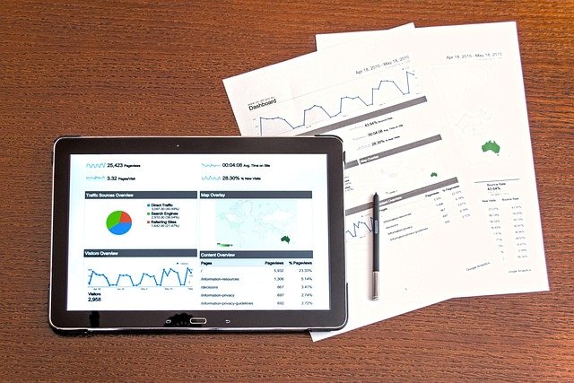
What is Data Visualization
Data visualization is the method used for presenting information and data in a visual format, using elements such as charts, graphs, and maps. Data visualization tools help us understand complex data sets by making them easier to see and interpret patterns, trends, and outliers. For the purpose of analyzing vast volumes of data and reaching informed decisions, data visualization tools and technologies have become essential in today’s world.
Let’s dive into the top AI tools for data visualization that are reshaping the landscape of data analysis.
Tableau: Turning Data into Visual Stories
Imagine a tool that doesn’t just display data but transforms it into a compelling visual narrative. That’s Tableau for you. With its user-friendly interface, Tableau allows even those new to data science to create engaging, interactive dashboards. Its AI tools for data visualization go beyond mere numbers, uncovering patterns and trends that tell a story hidden within the data. Whether you’re presenting to a boardroom or deciphering market trends, Tableau’s vivid visualizations make data approachable and understandable.
Power BI: Microsoft’s Vision of Data Democracy
Power BI, a gem from the tech giant Microsoft, democratizes data analysis. It’s not just about creating reports, but it’s also about unlocking insights. Power BI’s AI algorithms help you sift through vast datasets to find meaningful trends, making complex data analysis accessible to everyone. Its integration with other Microsoft products enhances its utility, making it a versatile tool for various business scenarios.
Qlik Sense: Discovering the Hidden Stories in Data
Qlik Sense takes you on a journey through your data, uncovering hidden narratives with its sophisticated AI tools for data visualization and intuitive interface. Its unique associative engine connects data points across multiple sources, revealing insights you might have missed. For those seeking to delve deeper into their data, Qlik Sense offers a balanced combination of automation and customisation, making it a favourite among data analysts.
Google Data Studio: Fostering Collaboration in Data Analysis
Google Data Studio excels in its ability to seamlessly blend data from various sources into cohesive, interactive reports. Google Data Studio’s implementation of AI does more than just streamline the process of data analysis. It fosters a collaborative environment where team members can unite their efforts, exchange insights and collectively make informed, data-backed decisions promptly. This all takes place within the versatile and interconnected realm of Google’s ecosystem, enhancing teamwork and efficiency.
D3.js: The Playground for Coders and Creatives
For those who love to code and crave creative freedom in data visualization, D3.js is a dream come true. It’s a JavaScript library that offers endless possibilities to visualise data in unique, interactive ways. While it requires coding knowledge, the payoff is the ability to create bespoke visualisations that stand out in both functionality and aesthetic appeal.
Sisense: Simplifying Complex Data
Sisense excels in its capability to seamlessly process complex data gathered from diverse sources, transforming it into visualisations that are both approachable and easy to interpret. Its integration of AI tools for data visualization plays a crucial role in forecasting trends and providing insights that lead to concrete actions, thereby establishing itself as an indispensable resource for those in decision-making roles.
Looker: Data Exploration for the Curious Minds
Looker, with its robust data modelling language, empowers users to explore and analyse data in real time. Its AI-driven insights and customisable dashboards make it an excellent tool for businesses focused on developing a data-driven culture.
Zoho Analytics: The All-rounder AI tools for Data Visualization
Zoho Analytics is known for its ease of use and comprehensive features. From AI-powered assistants to a wide array of visualisation options, it caters to both beginners and seasoned data analysts.
Splunk: The Data Detective
Splunk is unique in its ability to process and visualise real-time data, particularly useful in monitoring and operational intelligence. It’s like a detective making sense of the trail left by your data.
IBM Cognos Analytics: Trusted by Enterprises
IBM Cognos Analytics brings the reliability and power of IBM to data visualisation. Its AI tools for data visualization, analytics and intuitive interface make it a trusted choice for enterprise-level data analysis.
Your Journey in Data Science Begins Here
As you explore these AI tools for data visualization, remember that they are just the beginning. To truly understand what is data visualization and master the art and science of data visualisation, consider enriching your skills with a comprehensive data analytics course. Institutions like Imarticus Learning offer programs that not only teach you technical skills but also provide real-world applications and insights. Embrace this opportunity to transform data into insights and insights into action. The world of data awaits you!