


Last updated on September 22nd, 2026 at 04:28 pm
Not sure what data visualization is or how it can be used in a live data analytics role? Data visualization, in simple terms, is the process of converting raw data into charts, graphs, maps, dashboards, etc., using tools like Excel, Power BI, Tableau, Python, etc., to easily identify patterns and trends without having to read through all the numbers. Most working professionals use two or more than two of the common types of charts: bar, line, pie, and scatter plots.
Numbers don’t talk. A spreadsheet can contain the performance information for months at a time, but it’s usually not obvious by looking at the data alone what occurred. While the customer complains, the revenue drops, or the demand changes in the region, these issues may be under the radar and buried in thousands of rows, without being noticed until plotted. That’s exactly the problem data visualization was created for – and why it’s incorporated into nearly every data job description.
This guide explains what data visualization is, the various types of charts you’ll see at work, the fundamental methods and techniques that make a chart look clear vs confusing, and the tools that you should learn first to create a chart. It also explores the actual content of a structured data analytics course, and how it fits with a data analytics career as per the current market, where Imarticus Learning has seen Data Visualization Specialist as a tracked entry-level role with 2,000+ job openings that have an average salary of around ₹6 LPA.
What is Data Visualization?
It’s a good idea to begin with the task and then move on to the chart when describing what data visualization is. You would like to make a comparison between the sales in different regions. You would like to see a trend over one year’s time. You wish to identify a product that isn’t performing well. These comparisons, trends, and patterns are easier to see and act on with data visualization, which includes charts and graphs, maps, and dashboards.
Don’t Let Our Best Advice Get Buried
Add Imarticus as a Preferred Source — see more of what we publish, every time you search.

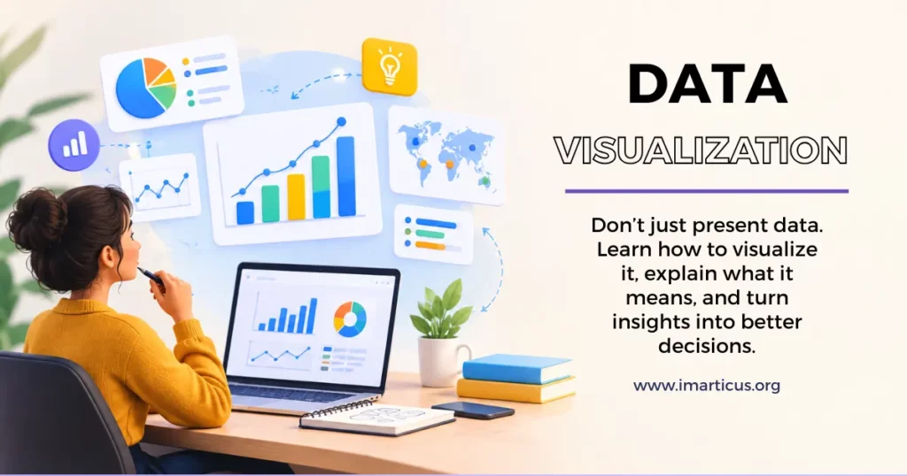
The data visulaization is all about making data visible to the person in a readable form in a short amount of time. Data visualization is a way of displaying data using typical graphics like charts, plots, infographics, and dashboards to allow decision-makers to clearly and quickly gain data-driven insights and data relationships that are complex.
Let’s take an easy one. Imagine if you did some fitness monitoring – if you wrote your weight down each single day, you will have a lengthy list of numbers, but it will be difficult to see what is actually going on. Mixed into that, though, are those weeks where you gained weight, those days where you lost weight, and those weeks where you didn’t.
A retail business can do the same with each of their daily sales; simply look at one line and they will instantly see which days are busy, which days are slow, which days have a sudden surge and which days are they losing sales in general. The essence of data visualization is to tell a story. It cuts down on the length of time it takes for an individual to go from raw information to an informed decision.
Definition of Data Visualization?
The best way to grasp the correct concept of data visualization is to observe what is happening before the chart is presented. Data must be gathered from its source (a database, a survey, a sales system, or an exported file). It then must be cleaned, as data duplication, missing data, or a different format can warp the data in a chart as much as in a spreadsheet. It’s only when the data is correct that the actual construction of the chart can start.
That’s why data visualization is mostly seen as another component of a data analytics process and not a skill in itself. With the correct data, analysts, business intelligence professionals, and data scientists are able to create charts and dashboards.
Watch this video to understand how Data Science and Analytics skills can help you build a career in today’s data-driven industry.
The Importance of Data Visualization
When you look at many job postings, such as Data Analyst, Business Intelligence Developer, or Product Manager, you can question why this skill is so pervasive. Let’s take a look at how data visualization can actually benefit the professionals who use it properly.
- Quicker decisions: The manager’s decision-making process becomes more efficient when the chart provides them with a clear summary instead of a long report.
- Pattern recognition: Trends, seasonal peaks, and anomalies that lie hidden in a spreadsheet will suddenly be apparent – when they should be.
- Better stakeholder communication: Numbers communicate much more powerfully with a visual story.
- Better trust with stakeholders: Clean, honest dashboards create credibility with leadership by showing, not just telling, that the analysis is correct.
- Detect errors early: Long before anyone realizes that there is a problem with data quality, a chart with an unexpected spike or a strange flat line will indicate that something is wrong.
Types of Data Visualization
Note that there is no right or wrong chart for any particular dataset, and one of the most frequent pitfalls in early career is selecting the wrong chart. Below is a summary of the major data visualization techniques, and when each type is really applicable.
| Chart Type | Best Used For | Common Tool |
| Bar Chart | Comparing values across categories | Excel, Power BI |
| Line Chart | Tracking trends over time | Tableau, Excel |
| Pie or Donut Chart | Showing proportions of a whole | Power BI, Google Sheets |
| Scatter Plot | Showing the relationship between two variables | Python, Tableau |
| Heat Map | Highlighting intensity or correlation | Python, Tableau |
| Histogram | Showing the distribution of one variable | Excel, Python |
| Geographic Map | Plotting location-based data | Power BI, Tableau |
| Dashboard | Combining several visuals into one interactive view | Power BI, Tableau, Looker Studio |
- A bar chart is suitable for comparing the revenue of regions or the number of employees in different departments because the categories are positioned side by side and the differences are easy to see.
- Line charts are the usual tool used to illustrate change over time, such as website traffic over a month or a year’s stock performance.
- Pie and donut charts show proportions of a whole, but are limited in the number of categories they can have, or they will detract from clarity.
- A scatter plot is a graph that plots points representing the values of two numeric variables, like advertising budget and sales.
- A heat map is a graphic representation of intensity across a grid and is commonly used in websites’ click patterns or correlation matrices.
- A histogram represents the distribution of one variable, for example, the distribution of the ages of customers.
- A geographic map is a map that represents data in geographic contexts, such as a map of sales performance in a region, or delivery times.
- A dashboard is a combination of the above and typically created in the form of an interactive view in a tool like Power BI or Tableau.
After you are familiar with matching the chart to the underlying question, selecting the appropriate data visualization ceases to be an act of guesswork and begins to be a relatively simple decision.
Data Visualization Techniques
Understanding various types of charts is just half the work. Then there is knowing how to create them properly and ensure they convey a clear message rather than confuse the reader even more. These are the data visualization methods that routinely set the professionals apart from the amateurs.
- Match the chart to the question. Use bar charts for comparisons, line charts to display change over time, pie charts to display proportions and histograms to display distribution. Choose according to what you want to say and not what looks good.
- Match the tool to the job. Excel handles quick, simple charts. Tableau and Power BI are built for interactive dashboards on larger data. Python and R come in when you need heavy customisation or the chart to fit into a bigger workflow.
- Apply the basics once the first two are right. Know your audience, keep the design clean, use colour to highlight rather than decorate, label clearly, and keep scales consistent so nothing looks distorted.
- Stick to one story per visual. Cramming multiple questions into a single chart usually means it ends up answering none of them well.
- Add interactivity where it helps. Filters, tooltips, and drill-downs let the reader explore at their own pace, instead of assuming they’ll follow your lead through a static view.
Accessibility is designed into the dashboard, using colour-blind friendly palettes, clear labels, and readable font sizes, so that the dashboard is usable by the person who created it, as well as everyone else.
The techniques seem simple enough, but deadlines can tempt even experienced analysts to be tempted to bypass the steps when it comes to the final product, and the end result will suffer.
Also Read: Power BI vs Tableau: A Comparative Study
Data Visualization Tools
The techniques matter, but professionals still need a tool to bring them to life. This is where many beginners get stuck, since the list of data visualization tools keeps expanding, and not all of them deserve equal attention.
| Tool | Best For | Learning Curve | Cost |
| Excel | Quick charts on smaller datasets | Easy | Free with Microsoft 365 |
| Power BI | Business dashboards, corporate reporting | Moderate | Free version available |
| Tableau | Advanced visual storytelling | Moderate to steep | Paid, with a free trial |
| Python (Matplotlib, Seaborn, Plotly) | Custom and statistical visuals | Steep | Free |
| Looker Studio | Marketing and web analytics dashboards | Easy | Free |
| D3.js | Fully custom, web-based visuals | Steep | Free |
For those who are just beginning, Excel is still an underrated and underestimated tool to get started in this area – although most people think they know it well, they only know part of what it can do. After that, Power BI and Tableau seem to be the two most common tools mentioned in job postings, and learning Python’s visualization libraries provides the ability to create charts that neither of the drag-and-drop tools can match.
The first tool to use may vary based on the job you’re trying to get. If you’re on a trajectory to business analytics or corporate reporting, then Power BI is likely a better bet, as there are so many organizations already running within the Microsoft ecosystem. If you’re going for data science or product analytics, you’ll find you need to get used to Python sooner, as it will give you access to the statistical models as well as the charts.
This is one such question professionals have, typically after watching a two-hour tutorial, and still not feeling a step closer to creating an actual, independent dashboard. Unfortunately, this is a skill that is taught in a series, rather than as a single subject.
Did You Know?
The reason why dashboard reporting is the norm today in most businesses is that it can show a trend, a comparison, or an outlier quicker than a reader can assimilate the message in a paragraph of written text.
Mistakes to Avoid in Data Visualization
Experienced people will get into a couple of recurrent traps occasionally. Knowing about these puts your work ahead of most of the beginners.
- Misleading scales: It can be misleading to start a bar chart axis at some point other than zero.
- Too much 3D: This can make it look like a 3D effect, but can also fool the viewer and make the comparison with reality difficult.
- Too many colors : Labels or data series in one visualization can make it harder for the reader to read and understand what’s being presented.
- Wrong type of chart: A pie chart that has 15 slices or a line chart for unrelated categories is less than clear.
- Ignore colour blindness: In many cases, red and green are a good mix, and a significant proportion of readers simply cannot tell the difference.
It’s a good practice to have another set of eyes review any dashboard prior to its release. A non-expert will find confusing labels or odd use of colour or a misleading scale much quicker than the individual who created it.
How To Learn Data Visualization with Imarticus Learning
This is one of the most common questions professionals ask, usually after watching a two-hour tutorial and still feeling no closer to building an actual dashboard independently. The honest answer is that this skill is learned in a sequence, not picked up in isolation as a standalone topic.
- Start with Excel. Learn to clean data and build basic charts before moving to anything more advanced.
- Move to SQL. Data cannot be visualised if it cannot first be pulled from a database, so querying comes before charting in a real workflow.
- Layer in Python or a BI tool. Once querying and cleaning feel comfortable, Power BI, Tableau, or Python’s visualization libraries begin to make far more sense.
- Practise on real, messy datasets. Clean textbook data teaches very little about the decisions analysts actually have to make on the job.
- Build a small portfolio. Two or three well-explained dashboards built on real projects do more for credibility than a certificate alone.
This is the space a structured, mentor-led programme is generally attempting to bridge – and it’s also the reason why students who learn from scattered resources often take longer to feel job-ready than those with a structured curriculum that includes feedback. If you want to test that structure before committing, Imarticus SkillHub offers free, self-paced courses to start with.
Once you have decided that structured learning is the right route, the useful question becomes what you will actually gain from the programme and what you will be able to show for it afterwards. The Data Analytics Course at Imarticus Learning takes a hands-on route through Excel, SQL, Python, Power BI, Tableau, and Gen AI tools. Imarticus Learning brings nine years of analytics education experience, 15,000+ placements, 2,000+ hiring partners, and a ₹24 LPA highest salary with a 52% average hike. The programme covers 35+ tools including Python, SQL, Power BI, Tableau, and Gen AI, backed by industry-experienced faculty and built-in mentorship with mock interviews.
Want to explore more? Check out Imarticus Learning’s website for deeper insights into data visualization courses and tools.
Suggested Articles:
FAQs About Data Visualization
Here are quick, straightforward answers to the questions people commonly ask about data visualization, its tools, its techniques, and how it fits into a broader data career.
What are the various kinds of data visualization?
Bar charts, line charts, pie/donut charts, scatter plots, heat maps, histograms, geographic maps, and dashboards. Each is suited to comparison, trend, proportion, relationship, or distribution.
Is SQL A Data visualization Tool?
No, SQL is a query language used to pull, filter, and organise data from a database. It is not a visualization tool on its own, but it almost always precedes data visualization, since the right data needs to be pulled out before it can be charted.
Is Excel A Data Visualization Tool?
Yes, Excel is one of the most widely used data visualization tools, particularly for smaller datasets. It offers bar charts, line charts, pie charts, and pivot tables, and remains a genuinely solid starting point before moving to specialised software.
What Are Four Types Of Data Visualization?
Four commonly used types are bar charts, for comparing categories; line charts, for tracking change over time; pie charts, for showing proportions of a whole; and scatter plots, for showing the relationship between two numeric variables.
What Are The 7 Stages Of Data visualization?
Most workflows broadly follow these stages: acquiring the data from its source, cleaning and organising it, exploring it for early patterns, choosing the appropriate chart type, designing the visual with clarity in mind, adding interactivity where it genuinely helps, and finally refining and sharing the output.
Can ChatGPT Do Data Visualization?
ChatGPT and similar AI tools can help generate chart code, such as Python scripts using Matplotlib or Seaborn, and can suggest which chart type suits a given dataset. However, it still needs accurate, well-prepared data and clear instructions, and human judgement remains essential for the final design and interpretation choices.
What Are The Top 5 Data Visualization Tools?
Based on current industry use, the top five are generally considered to be Power BI, Tableau, Excel, Python’s visualization libraries such as Matplotlib and Seaborn, and Looker Studio.
What Are The Benefits Of Data Visualization?
The main benefits include faster decision-making, easier pattern and trend detection, more persuasive data storytelling, stronger stakeholder trust in the analysis, and quicker detection of data quality errors.
What makes a chart clear and trustworthy?
The right chart type, a clutter-free design, purposeful colour use, clear labels, and consistent scales.
Which tools should you learn first?
Start with Excel for the basics, then move to Power BI or Tableau for dashboards, and Python or R when you need more customization.
What separates a tutorial chart from a hiring manager’s dashboard?
Handling messy real-world data, justifying design choices, and building something that actually drives a decision, not just displaying numbers.
From Understanding Data Visualization to Building A Career
The answer to the question of what data visualization is is a bit longer: It’s the technique of converting raw data into charts, graphs, and dashboards that anyone reading it can easily understand and use to make decisions.
Data visualization is part of Analytics, Business Intelligence, Product Management, and finance, and will not exist as a standalone skill. Requires clean data, good statistical judgment, and a capacity to interpret the results in a readily understandable manner for those who did not create the chart. An existing base of Excel and SQL can be enhanced with more dashboarding skills. visualization is a tool that a business analyst can use to make their findings more persuasive to the stakeholders. Someone entirely new to the field can build the full sequence from the ground up, starting with spreadsheets and working towards Python and Gen AI-assisted analytics.
For a structured route into this field, the postgraduate program in Data Analytics Course offered by Imarticus Learning covers data visualization alongside Excel, SQL, Python, Power BI, Tableau, and Gen AI tools, with hands-on projects and placement support built into the journey. That is the kind of learning that takes the question of what data visualization means beyond a definition. You start to understand the workflow behind it, the judgement it demands, and where your own skills can fit into the next stage of a data career.
Liked This? Follow Us Where You Already Search.
Preferred Sources is Google’s built-in follow button — no app, no login, just more Imarticus in your results.