


Last updated on May 15th, 2026 at 03:05 pm
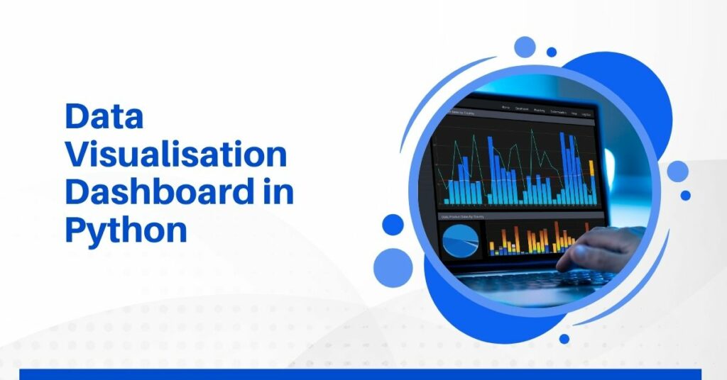
Data visualisation has completely changed the way we work. Being buried in spreadsheets and CSV files and losing precious hours trying to explain patterns to stakeholders is now a thing of past.
The moment you turn raw data into simple visuals like bar charts, line graphs, and even heatmaps, conversations become faster, clearer, and a whole lot more productive.
If you’re someone who deals with data regularly (whether you’re in marketing, finance, operations, or even product design), visuals are indispensable. They help you spot outliers you’d otherwise miss, highlight trends instantly, and back up your ideas with clear, visual proof.
And here’s the best part: Python makes all of this effortlessly doable. With a few lines of code using libraries like Matplotlib or Seaborn, people with basic coding skills can build clean, meaningful visual reports.
If you’re keen to delve deeper into data science and analytics, consider exploring this data science course by Imarticus Learning. Meanwhile read this blog for a comprehensive tutorial on building data visualisation dashboard.
Why Data Visualisation Matters
Teams spending hours analysing raw data when a 3-second glance at a bar chart could’ve done the trick is a common sight. What they essentially need is a visual. A good data dashboard brings exactly that with clarity. It helps:
- Spot trends quickly
- Identify issues before they blow up
- Communicate insights to others without explaining every number
What is Data Visualisation in Python?
It’s the process of converting data into charts, graphs, and dashboards using Python tools.
You can:
- Plot line charts to track growth
- Use bar charts to compare items
- Create pie charts to show composition
- Build dashboards that combine everything
Python makes all of this easier because of the huge number of ready-made libraries available, like Matplotlib, Seaborn, and Plotly.
Top Python Libraries for Data Visualisation
Here’s a list of libraries I’ve personally used:
- Matplotlib: Great for basic charts. It’s like your visual calculator.
- Seaborn: Built on top of Matplotlib, and it looks nicer.
- Plotly: Best for interactive visualisations. Think zoom-in, tooltips, sliders.
- Dash: If you want to build full dashboards (like apps).
- Streamlit: Fastest way to build dashboards without fuss.
Setting Up Your Environment
Before you start building your dashboard, you need to set up your Python environment. Ensure you have Python installed on your system. If not, download and install it from the official Python website.
Next, install the necessary libraries. Open your terminal or command prompt and run:
| pip install pandas matplotlib seaborn plotly dash |
This command will install Pandas for data manipulation and our visualisation libraries: Matplotlib, Seaborn, Plotly, and Dash.
Load and Prepare Your Data
Use pandas. Always. It’s the foundation for any good Python data visualisation.
| import pandas as pddata = pd.read_csv(‘yourdata.csv’) |
Now clean it:
| data.dropna(inplace=True) # Removes missing valuesdata[‘Date’] = pd.to_datetime(data[‘Date’]) |
Your First Chart in Python
Here’s a basic line chart:
| import matplotlib.pyplot as pltplt.plot(data[‘Date’], data[‘Revenue’])plt.title(‘Revenue Over Time’)plt.xlabel(‘Date’)plt.ylabel(‘Revenue’)plt.show() |
That’s your first visual. Simple, right?
Building a Data Dashboard With Streamlit
Now that we have covered the basics, let’s move from charts to a full-on data dashboard.
| import streamlit as stst.title(‘My Sales Dashboard’)st.line_chart(data[‘Revenue’])st.bar_chart(data[‘Profit’]) |
Customising the Dashboard
Want to make it interactive? Add filters:
| year = st.selectbox(‘Choose Year’, data[‘Year’].unique())filtered_data = data[data[‘Year’] == year]st.line_chart(filtered_data[‘Revenue’]) |
This gives control to the user. That’s what makes a good dashboard.
How to Build a Python Data Dashboard
Now that you’ve got the basics out of the way, let’s actually build the thing. Here’s a quick layout of what we’ll put into our data dashboard.
a) Start With the Structure
Your dashboard doesn’t need to be pretty from the start. Function over fashion. Begin by structuring the layout.
You can use st.columns() in Streamlit or subplots in Plotly to split your screen into sections.
b) Add Multiple Visuals
Show different aspects of the data. A sales dashboard might include:
- A line chart for monthly revenue
- A bar chart for top-performing regions
- A pie chart showing product category contribution
- A KPI card (just numbers!) for total sales
c) Make It Interactive
This is the fun part. Let users choose the year or filter by region. Use:
| option = st.selectbox(‘Select Year:’, data[‘Year’].unique()) |
You’ll instantly see your graphs updating as people interact with the drop-downs and sliders.
Here’s a quick example of how Streamlit handles interactivity:
| import streamlit as stimport pandas as pdimport matplotlib.pyplot as plt df = pd.read_csv(‘sales.csv’)year = st.slider(‘Choose a year’, 2015, 2024, 2022)filtered_df = df[df[‘Year’] == year]st.line_chart(filtered_df[‘Revenue’]) |
That tiny bit of code gives your users control and makes your Python data visualisation dashboard way more useful.
Real Dashboard Example
Let’s say you’re building a dashboard for a logistics company to track fleet performance.
Here’s how you might break it down:
| Metric | Chart Type | Notes |
| Fuel Efficiency | Line Chart | Show efficiency trends monthly |
| Breakdown Incidents | Bar Chart | Compare across regions |
| Average Delivery Time | KPI Card | Keep it on top |
| Driver Ratings | Pie Chart | Visualise distribution |
And here’s another one for sales performance:
| Section | Visual Type | Interactivity Feature |
| Monthly Revenue | Line Chart | Filter by region |
| Product Category | Pie Chart | Filter by month/year |
| Top Reps | Bar Chart | Clickable to view details |
| Total Sales | Metric Counter | Updates with filter |
By breaking it up, you’re not just presenting data, you’re helping stakeholders and anyone involved understand it fast.
Common Mistakes When Making Data Visualisation Dashboards
Some dashboards look like they were built by someone with 20 tabs open- a complete mess. Here’s what you should avoid:
- Too much information: If it’s overwhelming, nobody will use it.
- Poor labelling: Every chart needs a clear title and axis labels.
- Bad colour use: Don’t go neon just because you can.
- Lack of filters: People want to dig into the data they care about.
Keep it clean. Keep it relevant.
Best Practices for Python Data Visualisation
Over the years, my experience has taught me quite a few tips and tricks on creating data visualisation Here’s what stuck with me:
- Keep visualisations simple: Clarity wins over complexity.
- Use consistent colours: Especially across categories.
- Label everything: Axis, title, legends—don’t skip.
- Give context: Add tooltips or small notes for better understanding.
- Test with users: What makes sense to you might confuse someone else.
Good External Resources to Check Out
Need extra material or want to go deeper? Here are some high-authority sources I often use:
- 12 Principles of Data Visualization (Investopedia)
- Streamlit Documentation
- Matplotlib — Visualization with Python
- Building an Interactive Dashboard with Plotly Dash in Python (Medium)
All of these helped me build better dashboards and will help you too.
Watch These Video Tutorials from Imarticus
Here are two practical videos from Imarticus Learning to help you visualise and work with Python-based data dashboards. Worth watching!
Python Libraries: NumPy, Pandas and Matplotlib for Machine Learning Simplified for Beginners
Conclusion
You’ve just scratched the surface of what’s possible with Python data visualisation. Once you get the hang of it, building dashboards becomes second nature and even addictive.
But if you’re serious about growing in this field, I highly recommend something structured. You need theory, real-world practice, and projects that will actually prepare you for the industry.
That’s where the Postgraduate Program in Data Science and Analytics by Imarticus Learning comes in. It’s not just another course. It’s built for professionals who want to get hands-on with tools like Python, dashboards, data analytics, and more.
FAQs
- What is data visualisation in Python?
It’s how you turn data into graphs or dashboards using Python. Makes data easier to understand.
- Which libraries should I start with?
Go with Matplotlib or Seaborn first. Move to Plotly or Streamlit later.
- Is Python better than Excel for dashboards?
Yes, especially for automation and scalability.
- Can I build interactive dashboards?
Absolutely. Use Streamlit or Dash.
- How long does it take to learn?
You can build basic dashboards within a week if you stick with it.
- Do I need to be good at coding to learn Python data visualisation?
Not really. You just need the basics. There are plenty of tutorials and courses to help you level up.